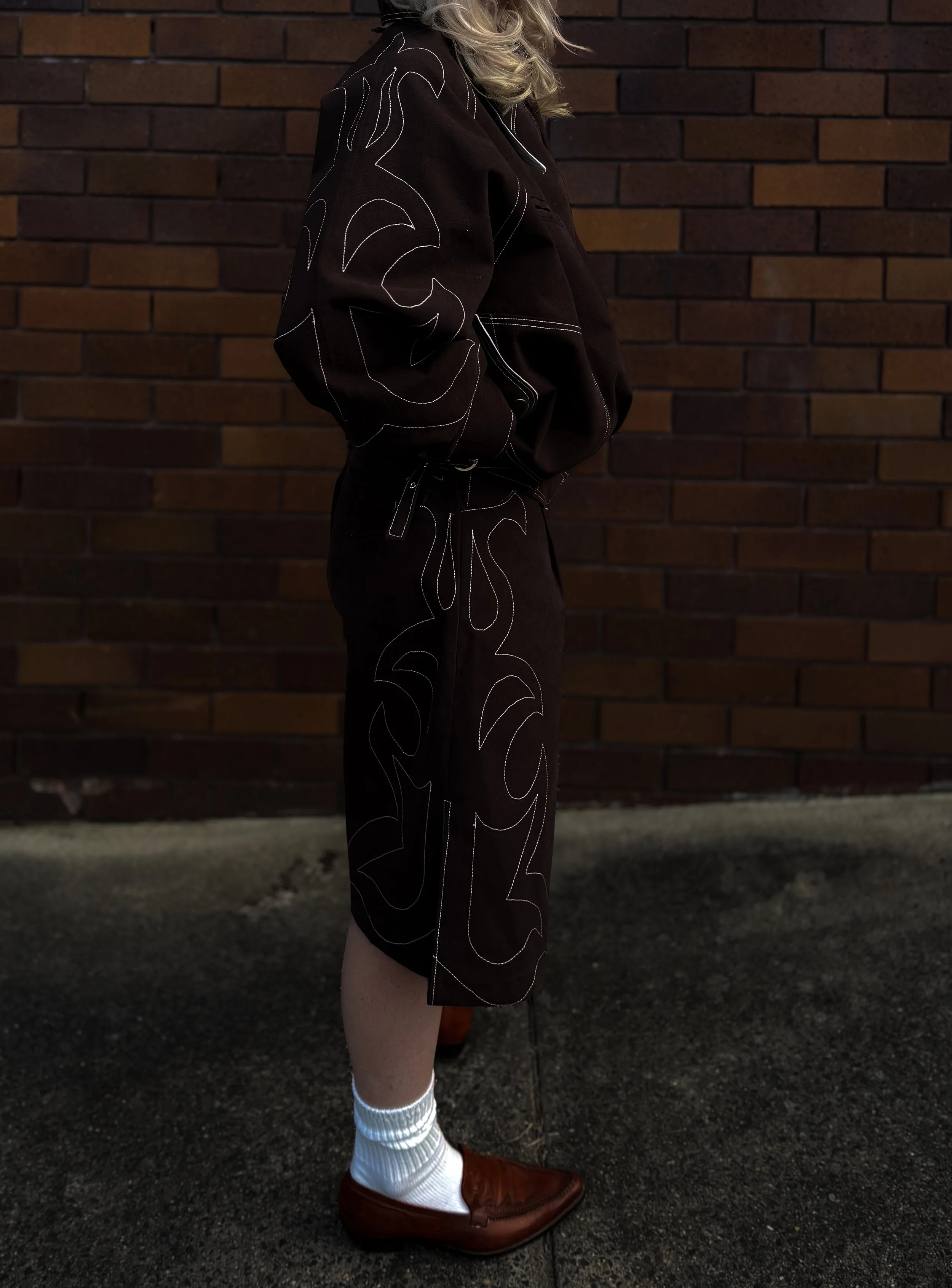
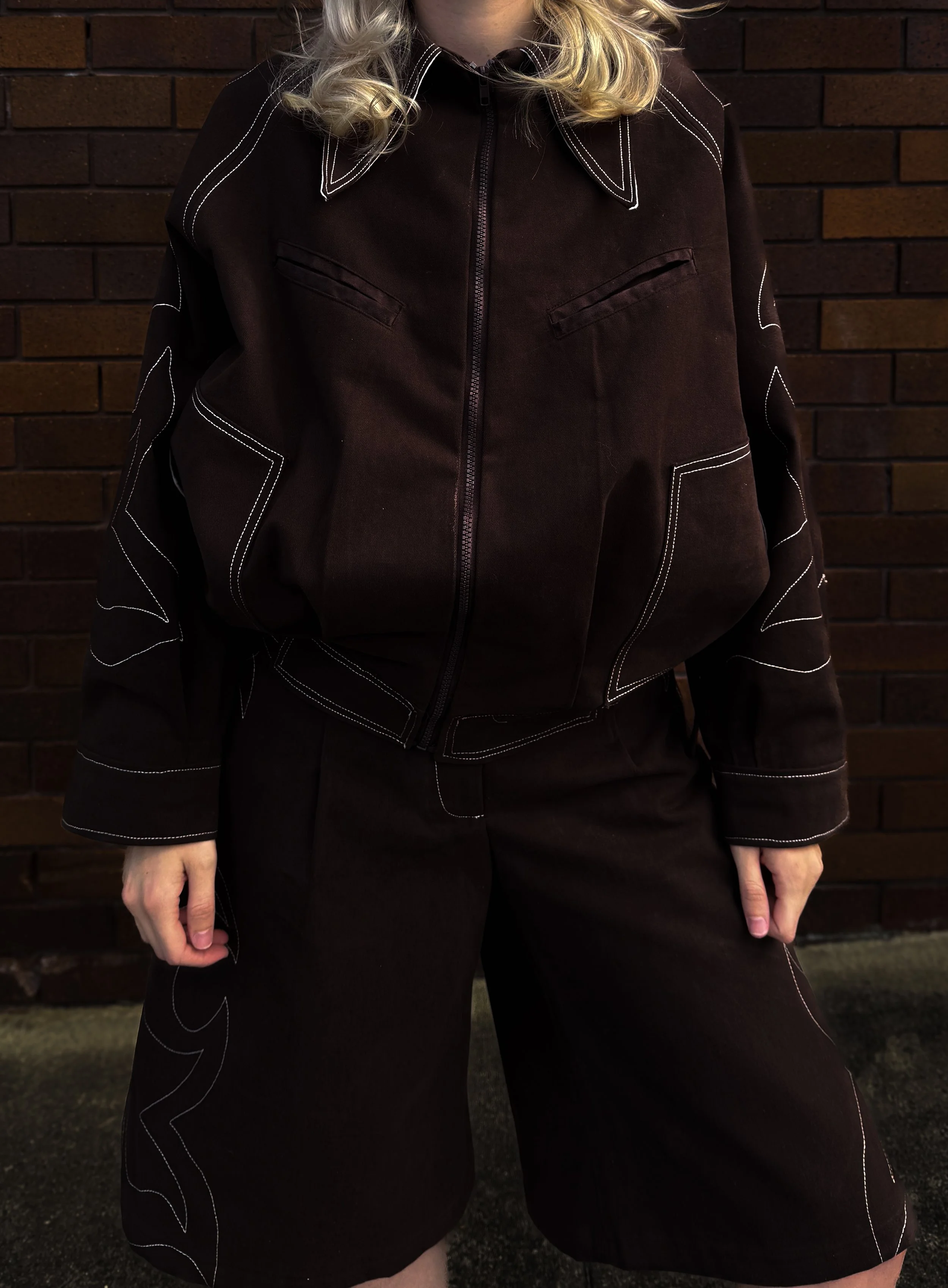
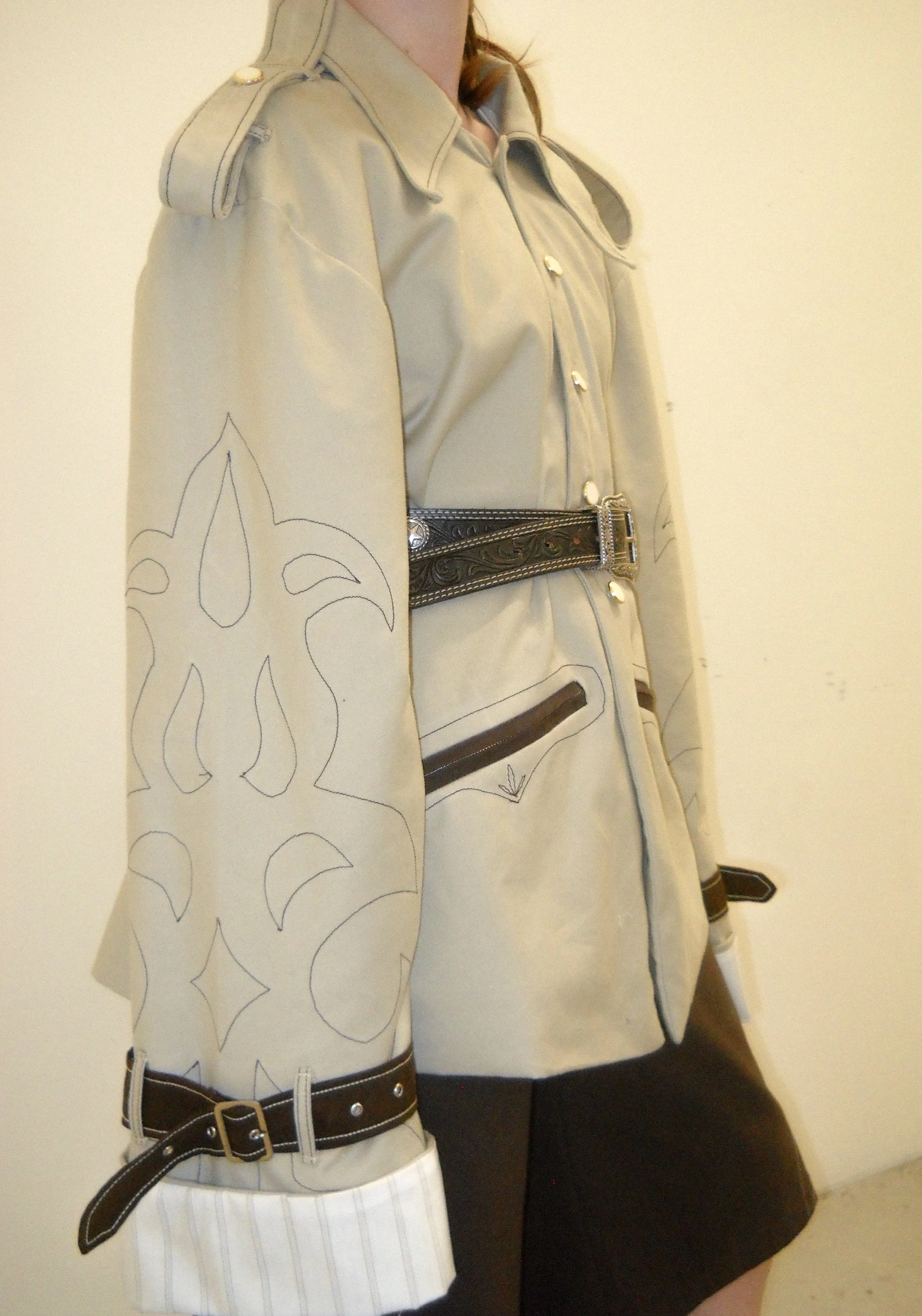
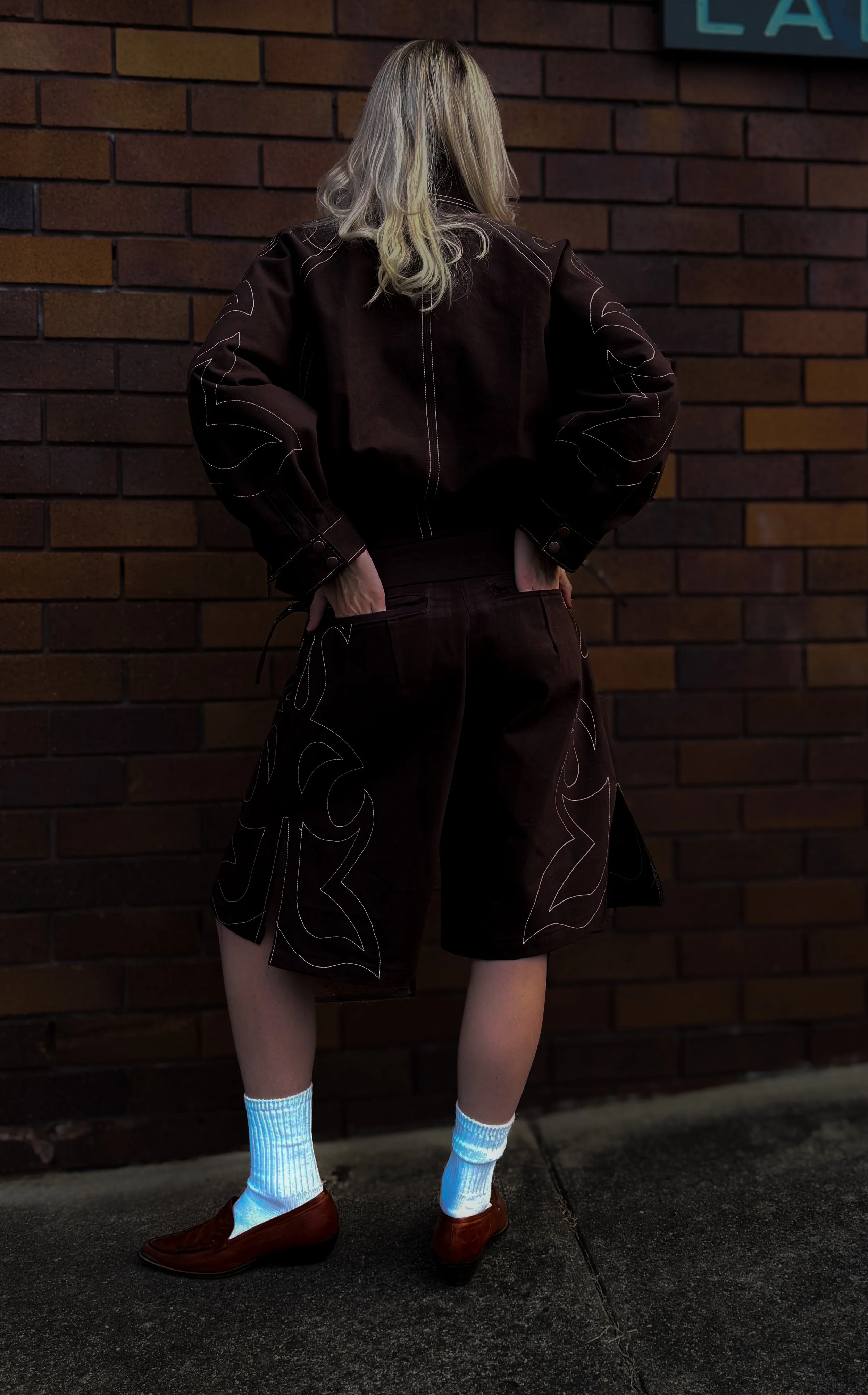
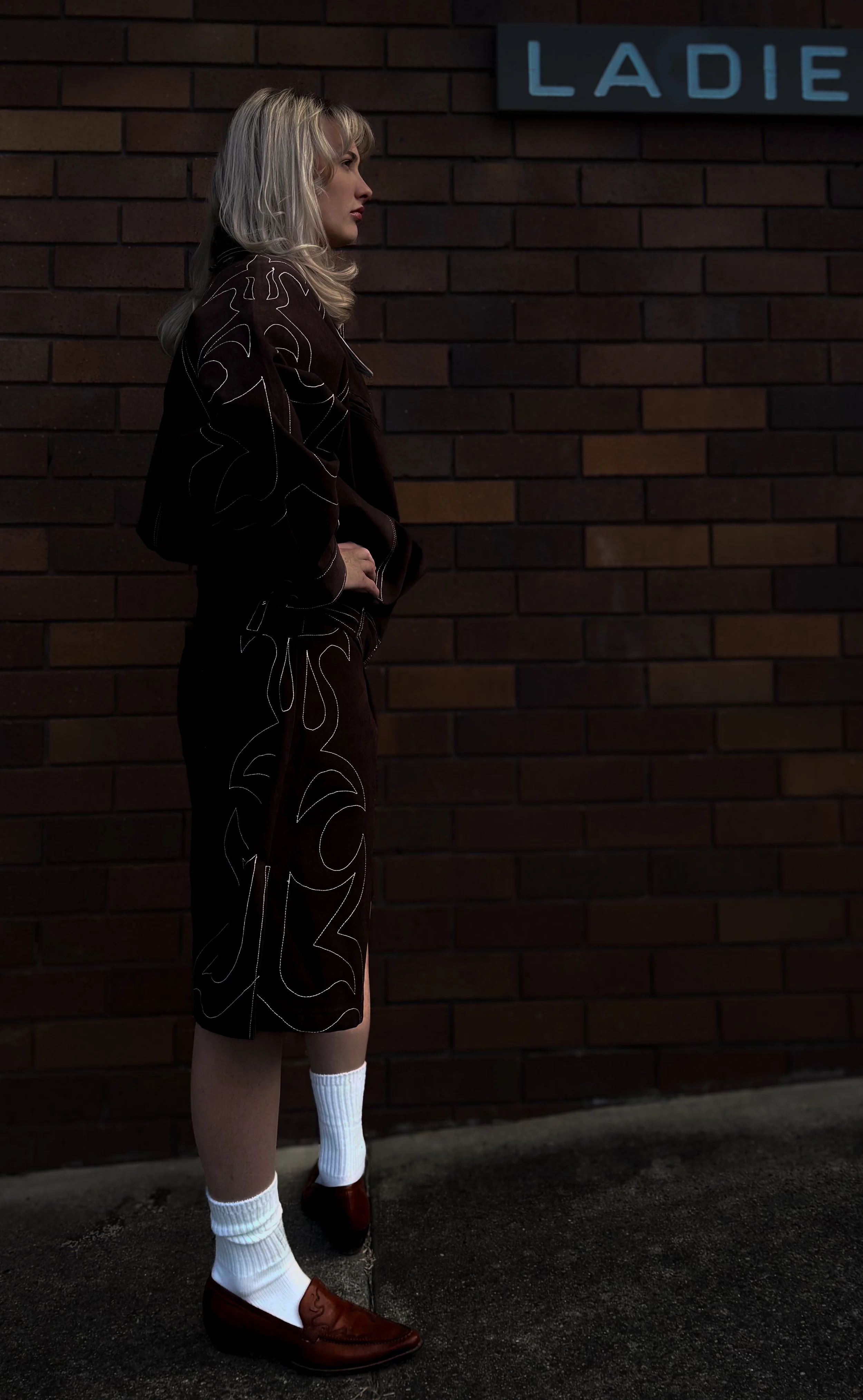
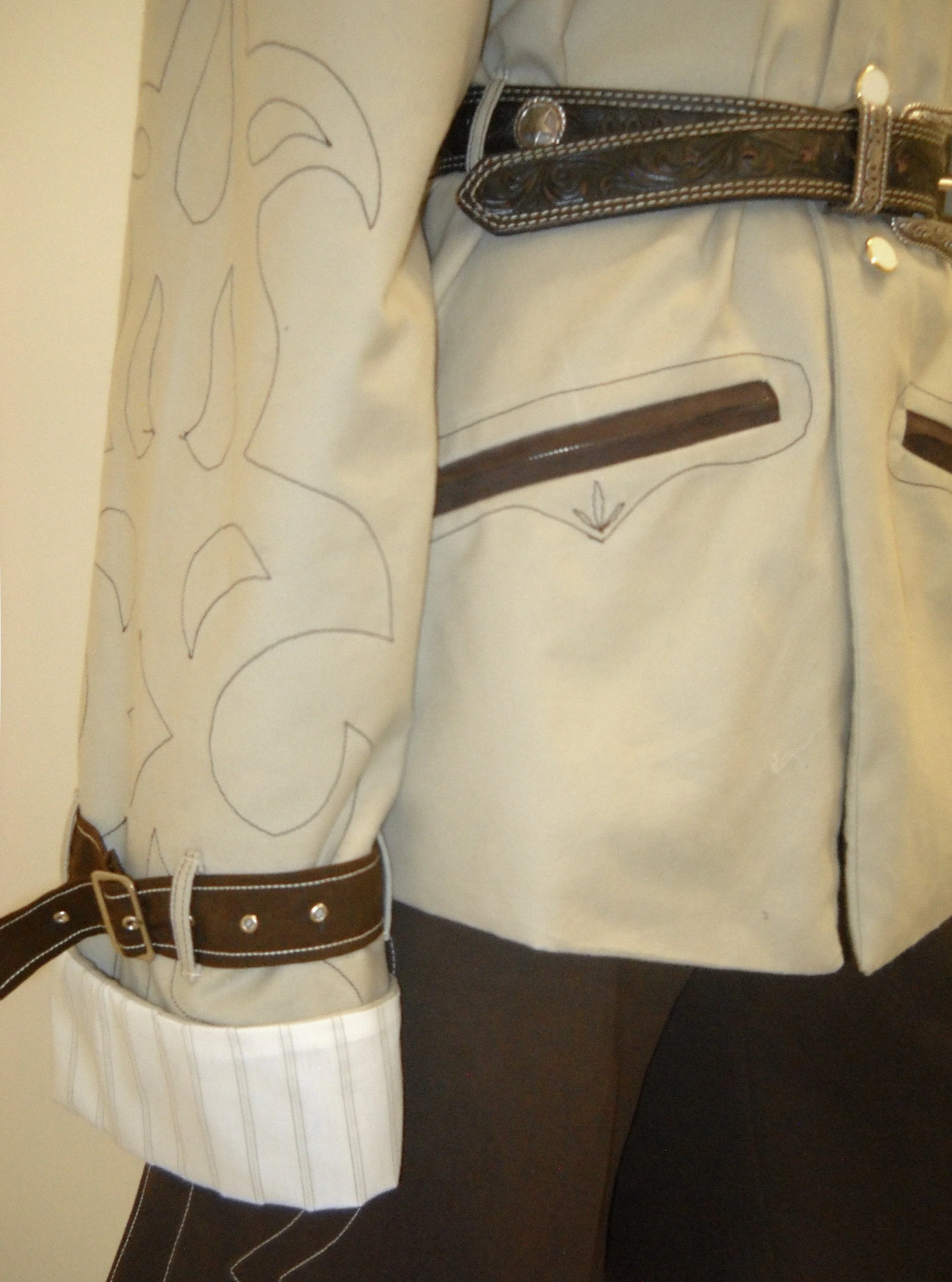
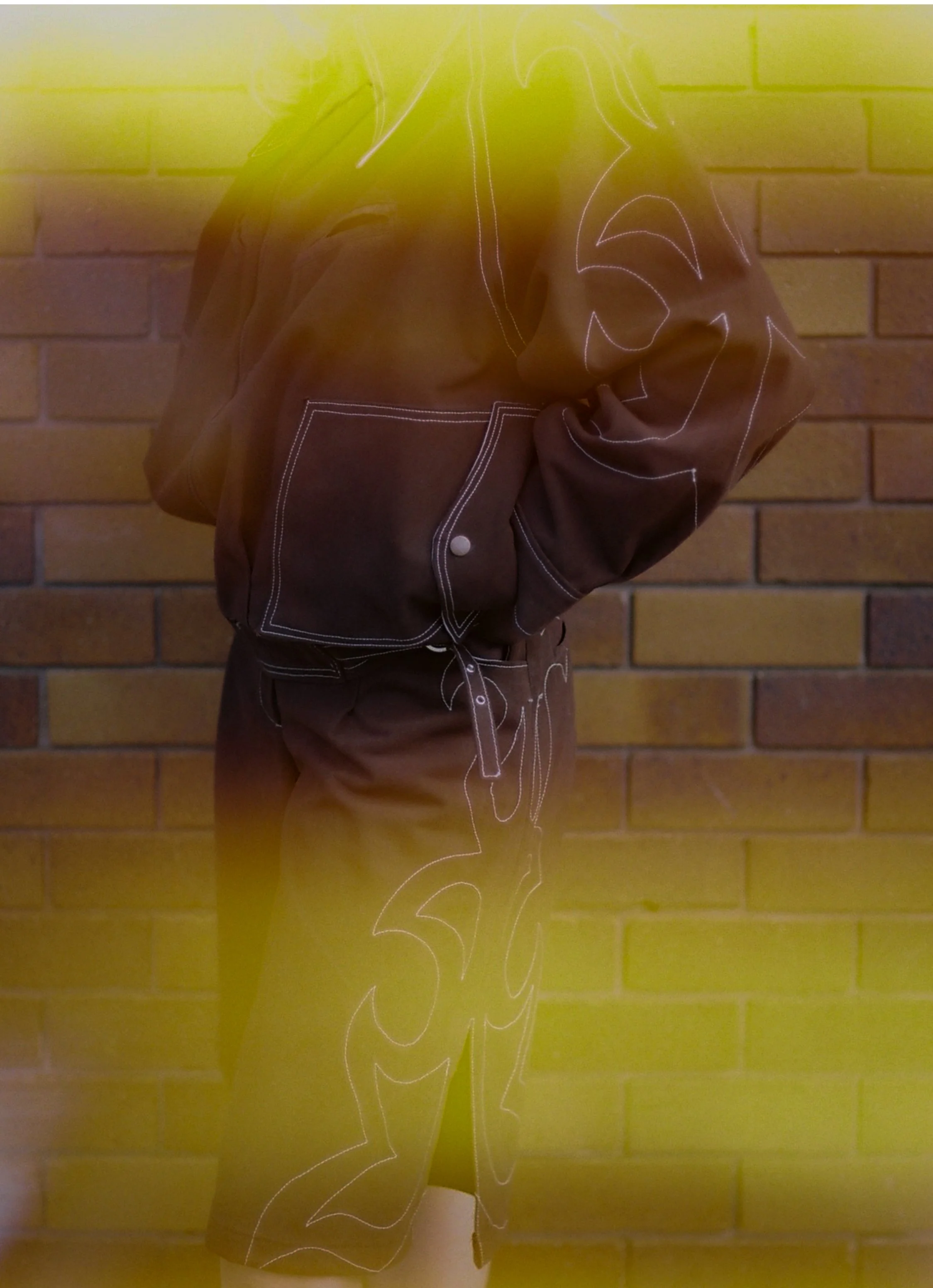
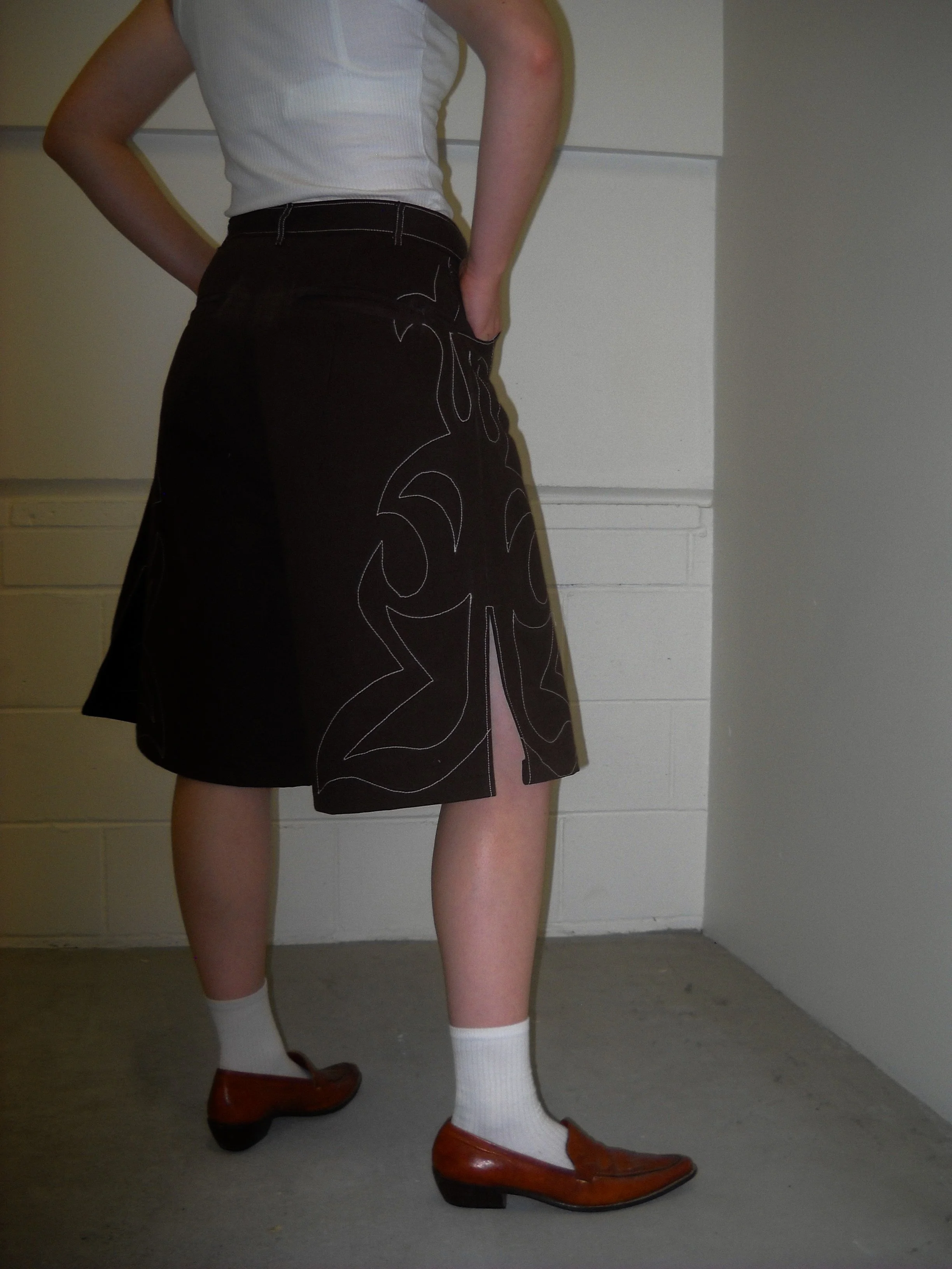
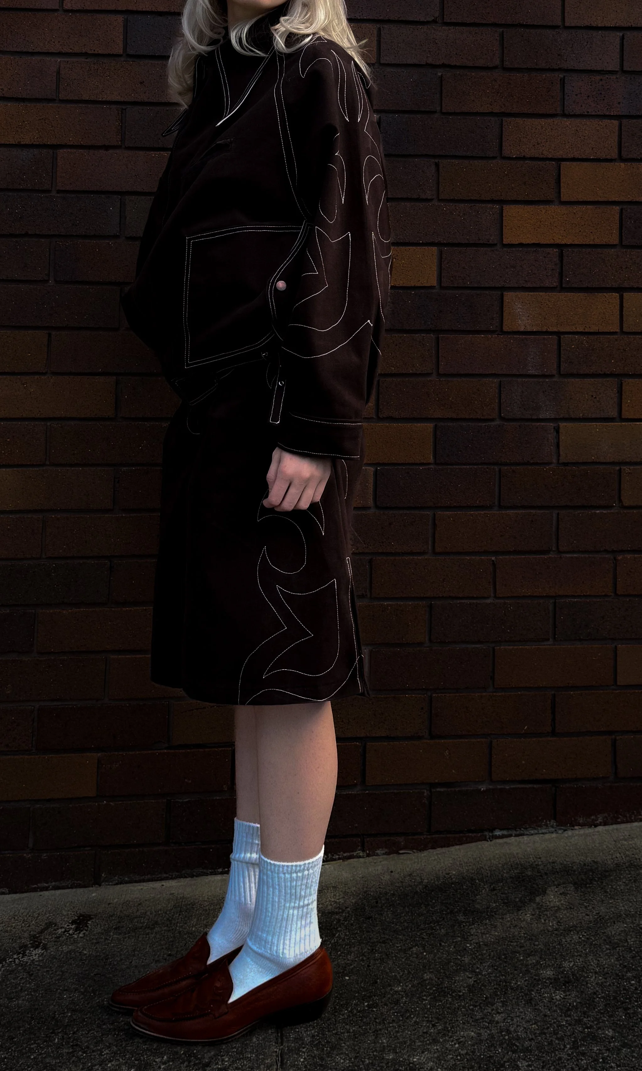
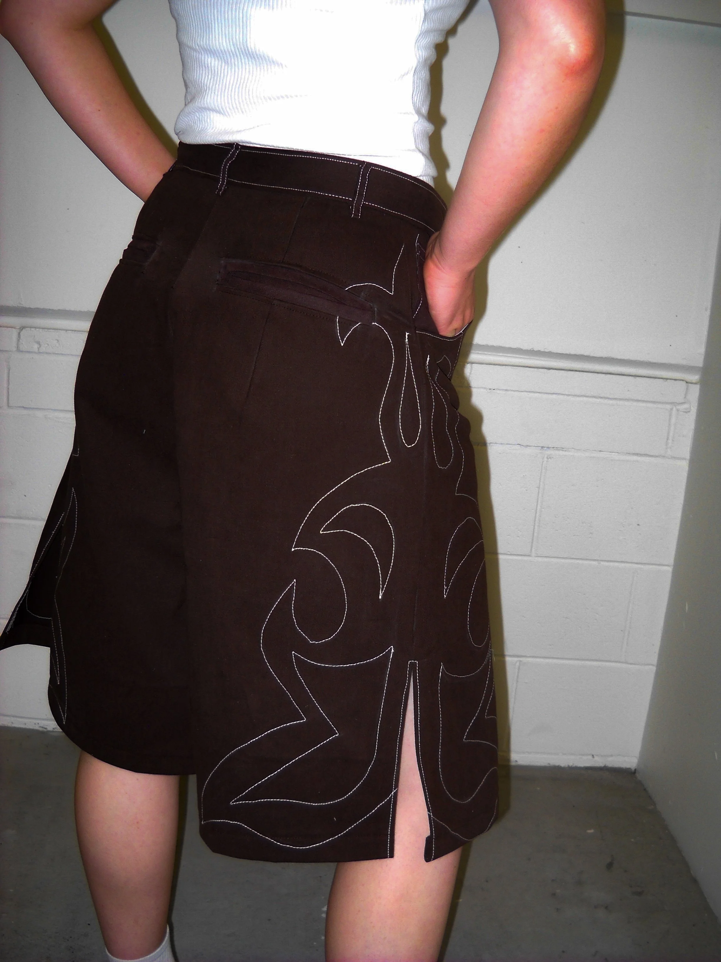
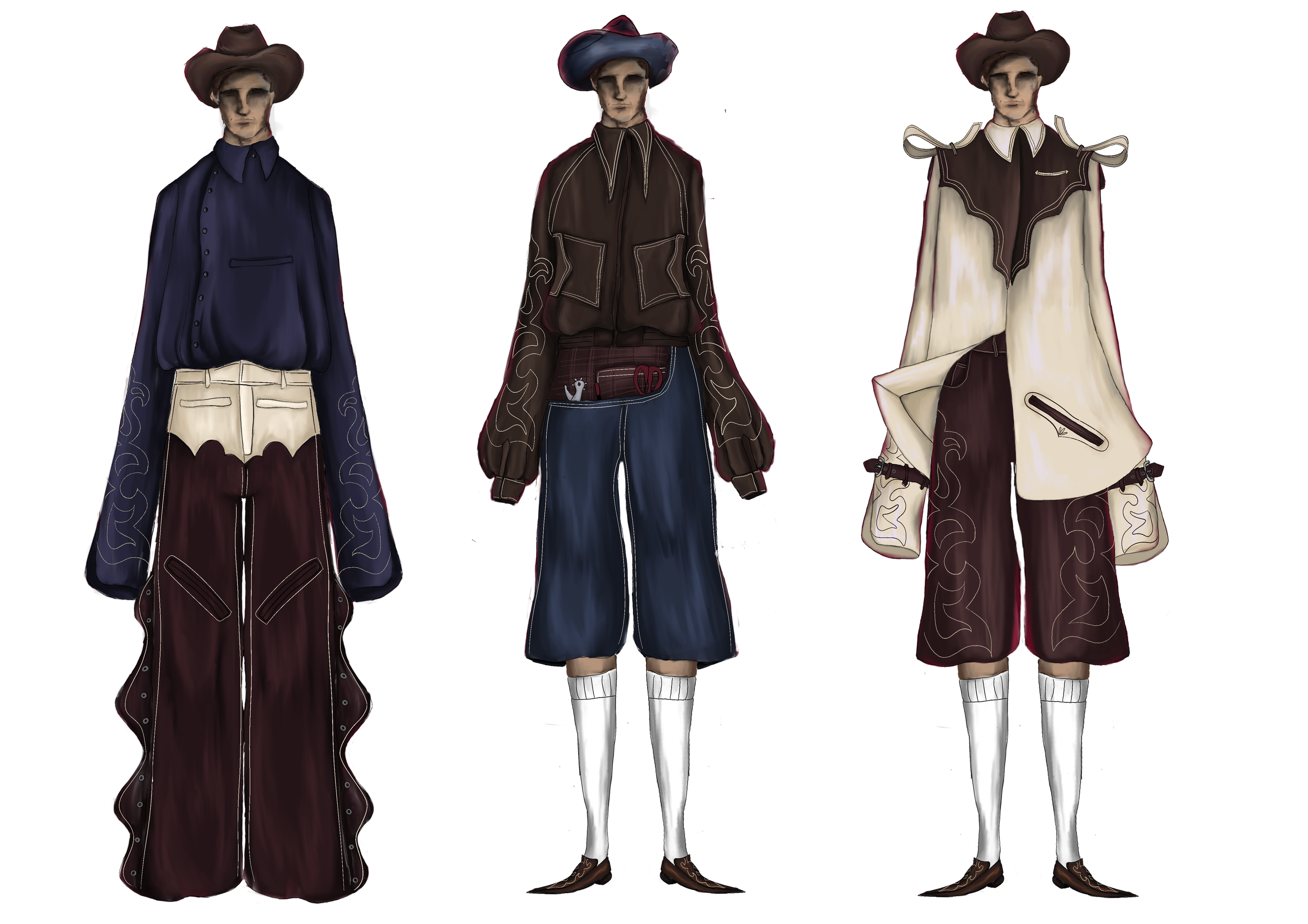
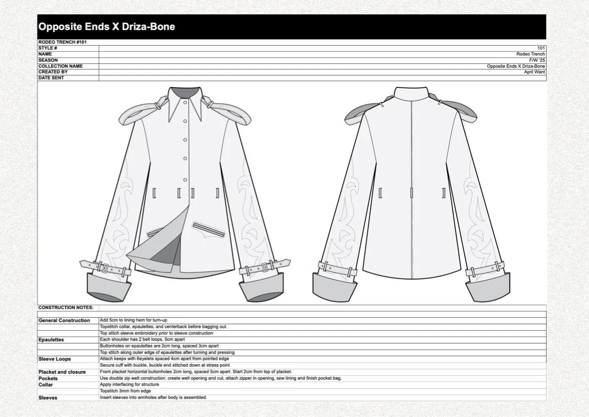
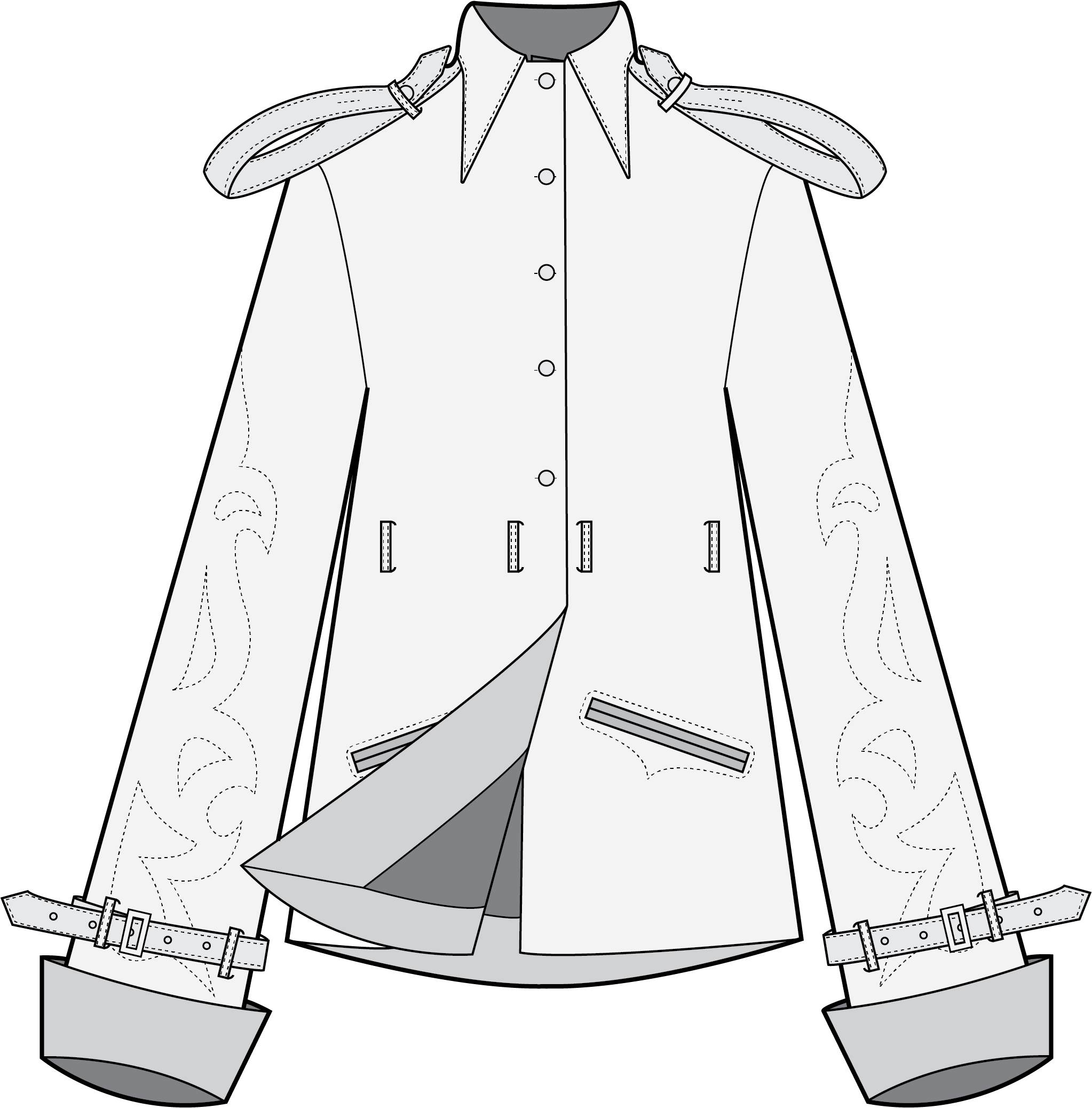
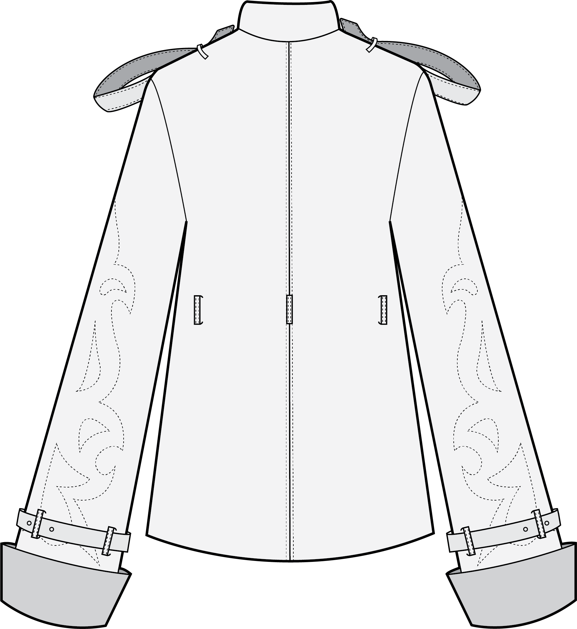
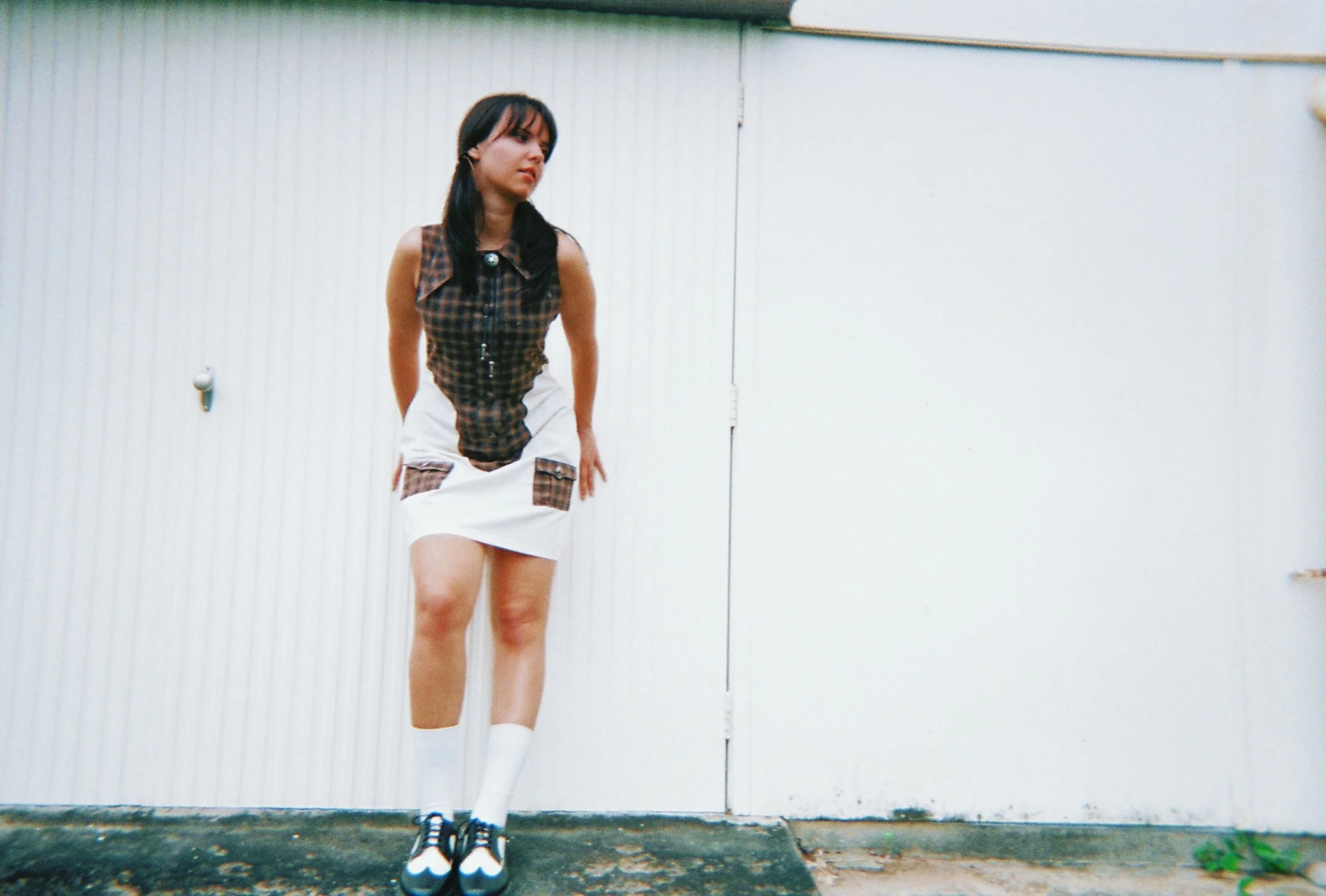
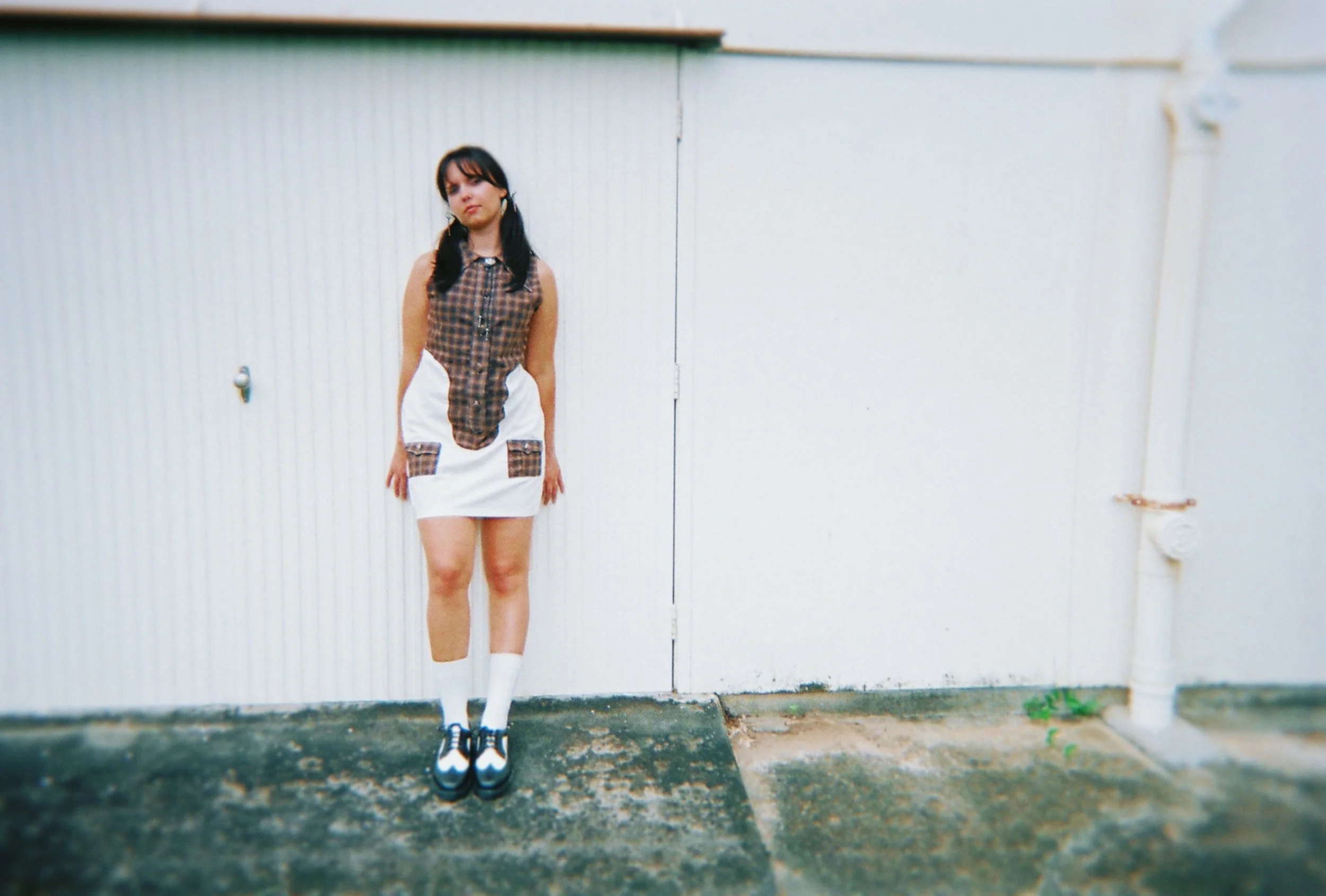
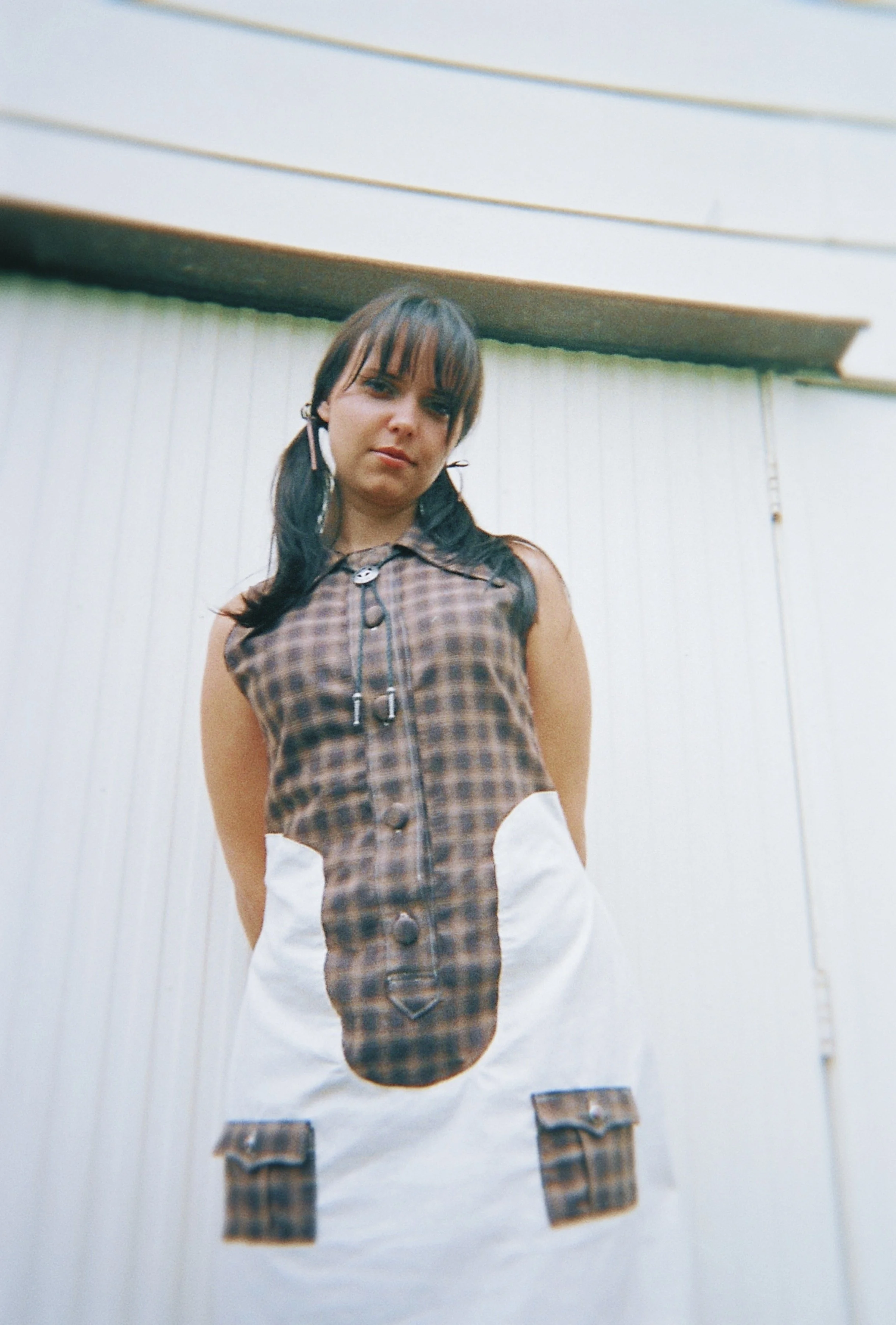
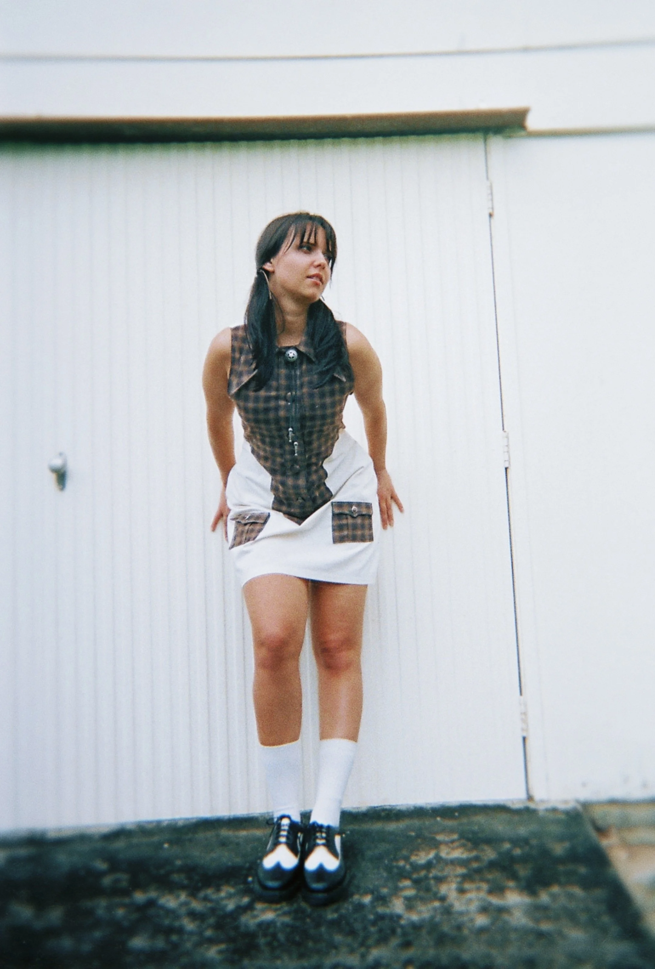
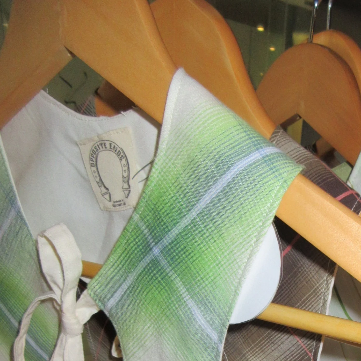
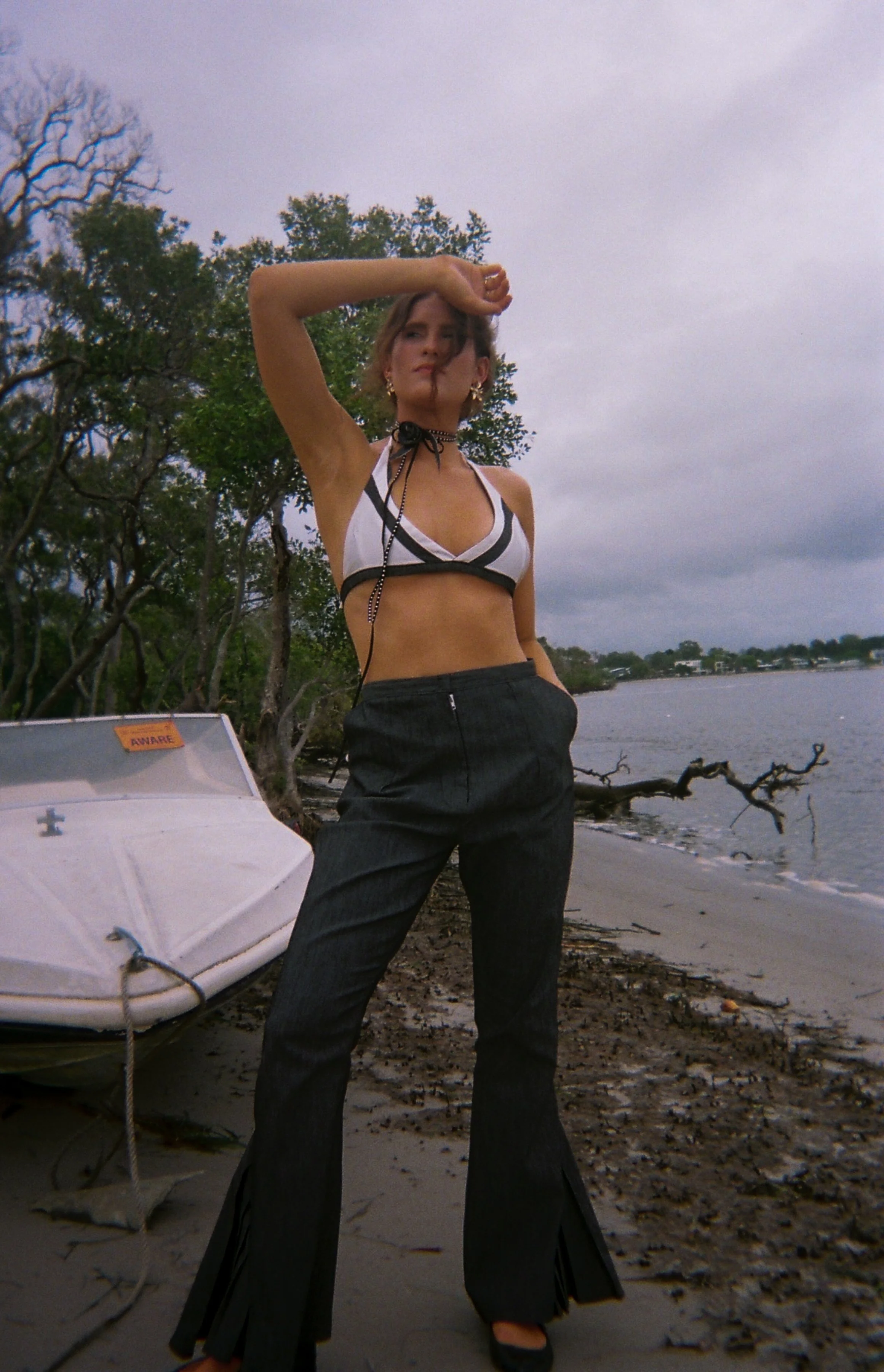
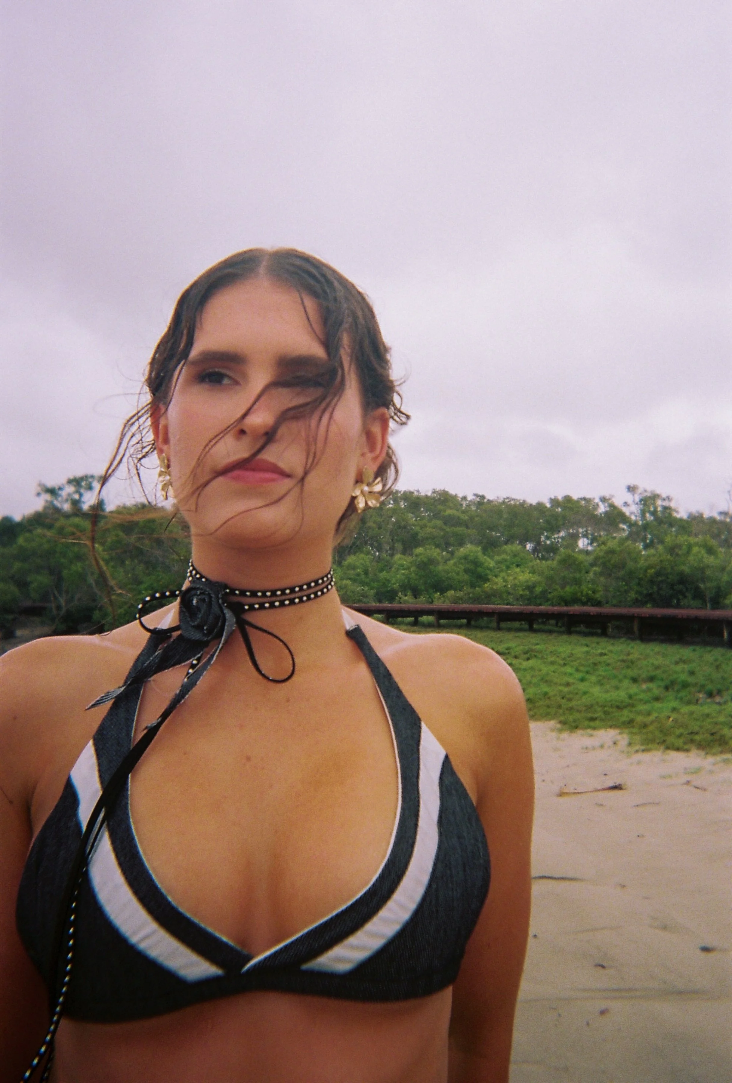
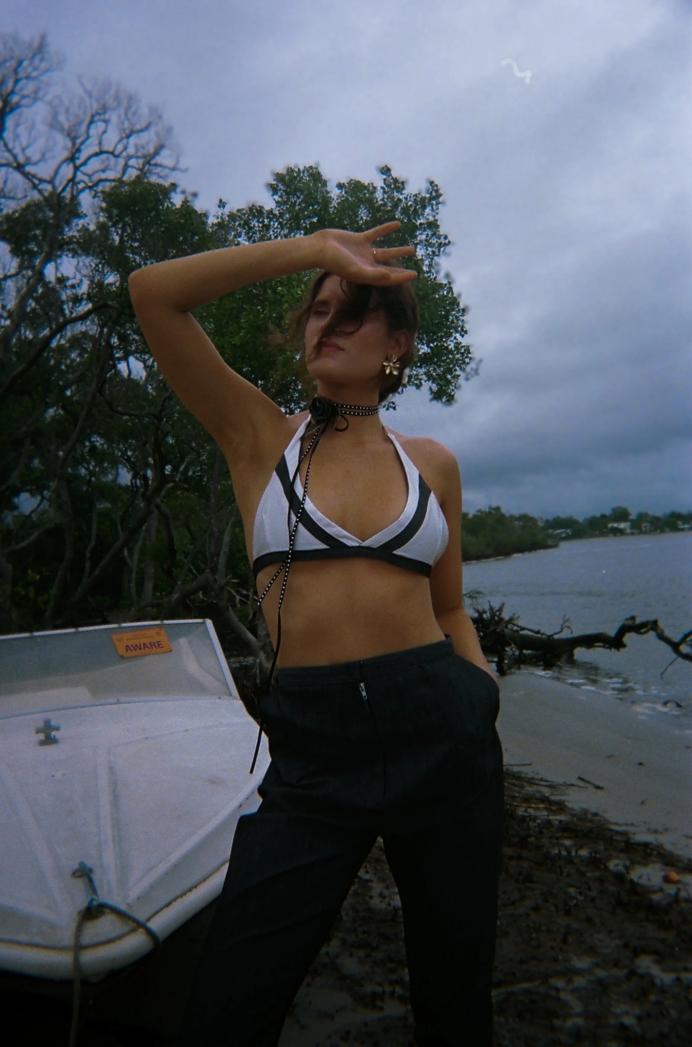
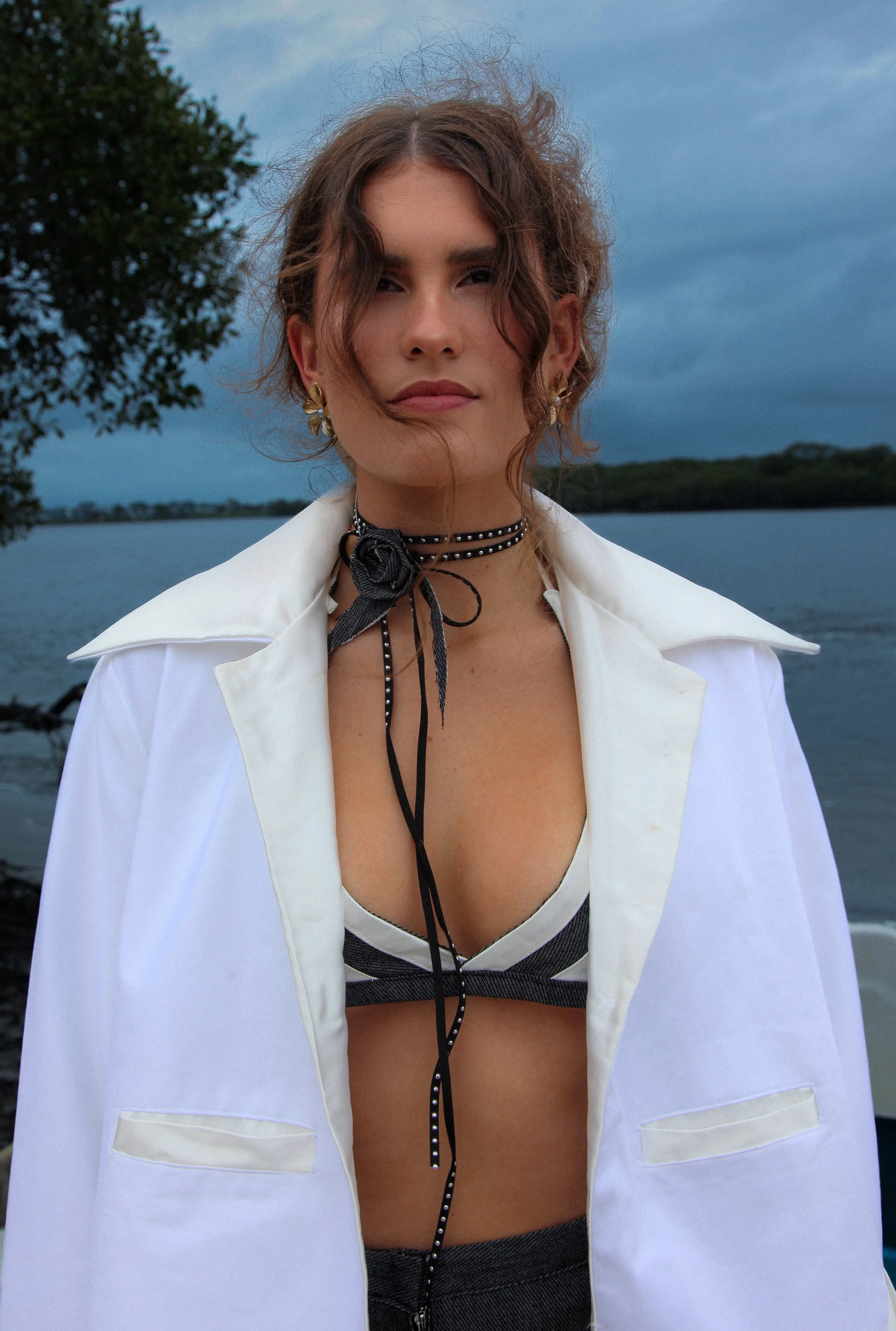
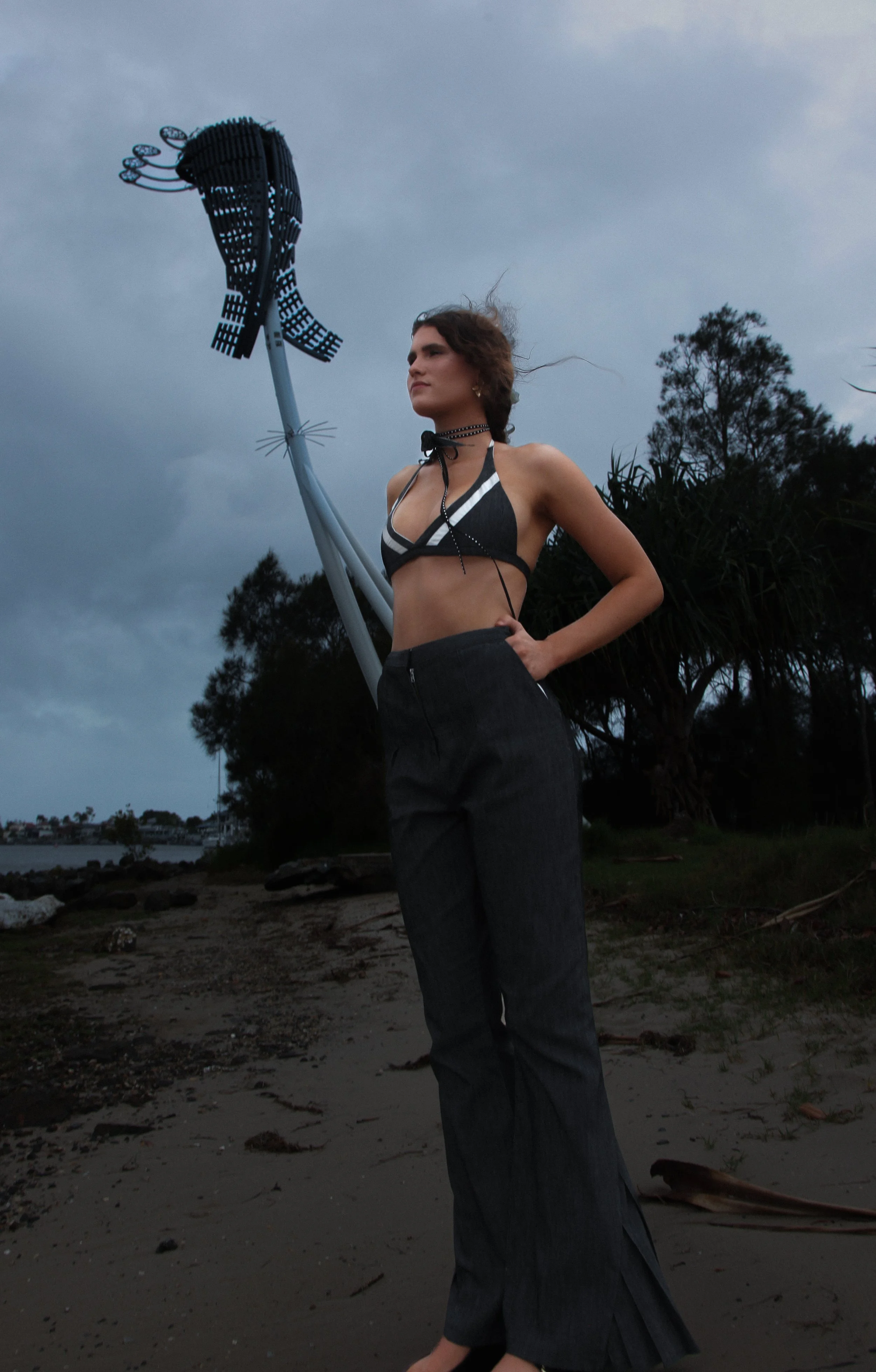
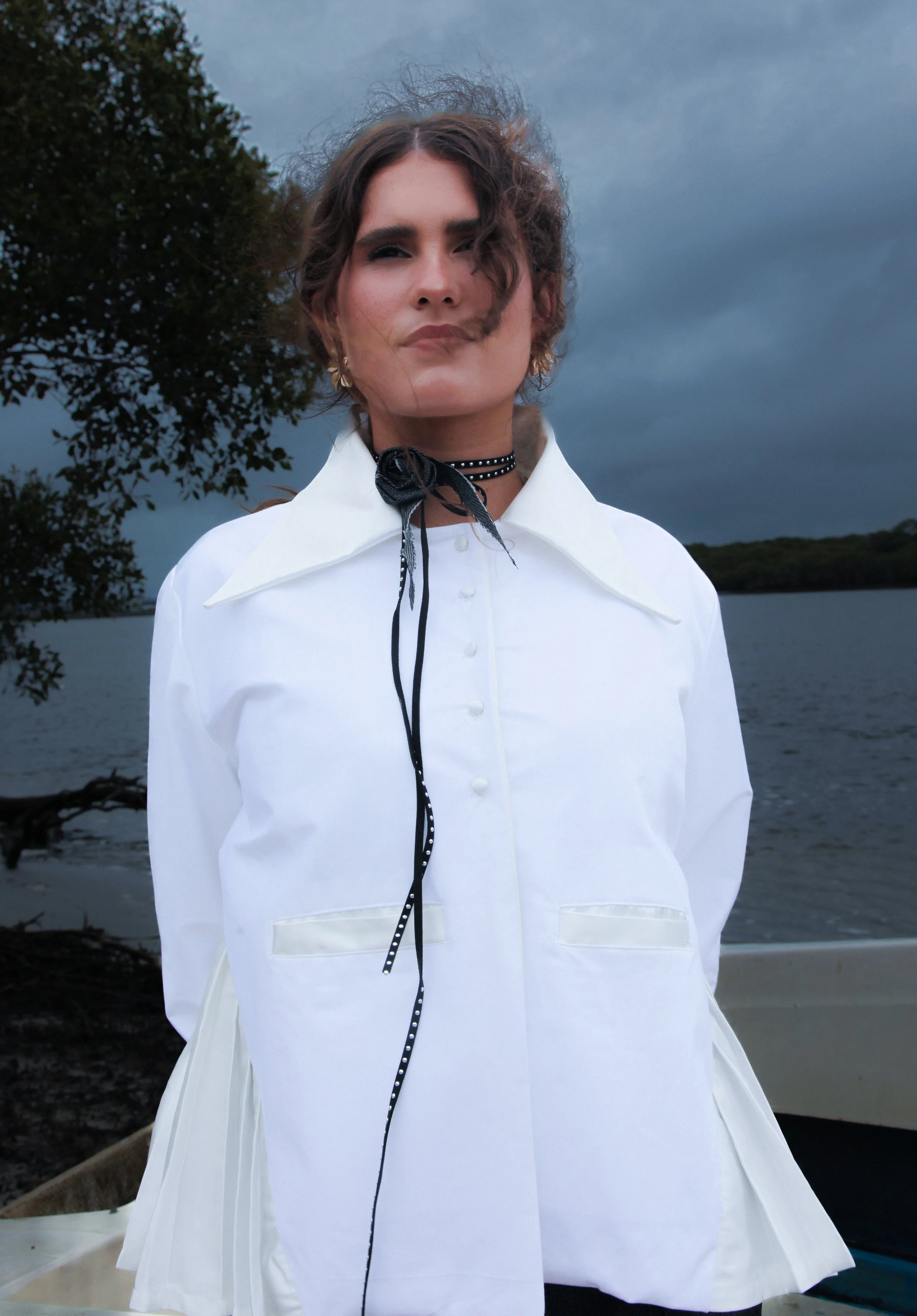
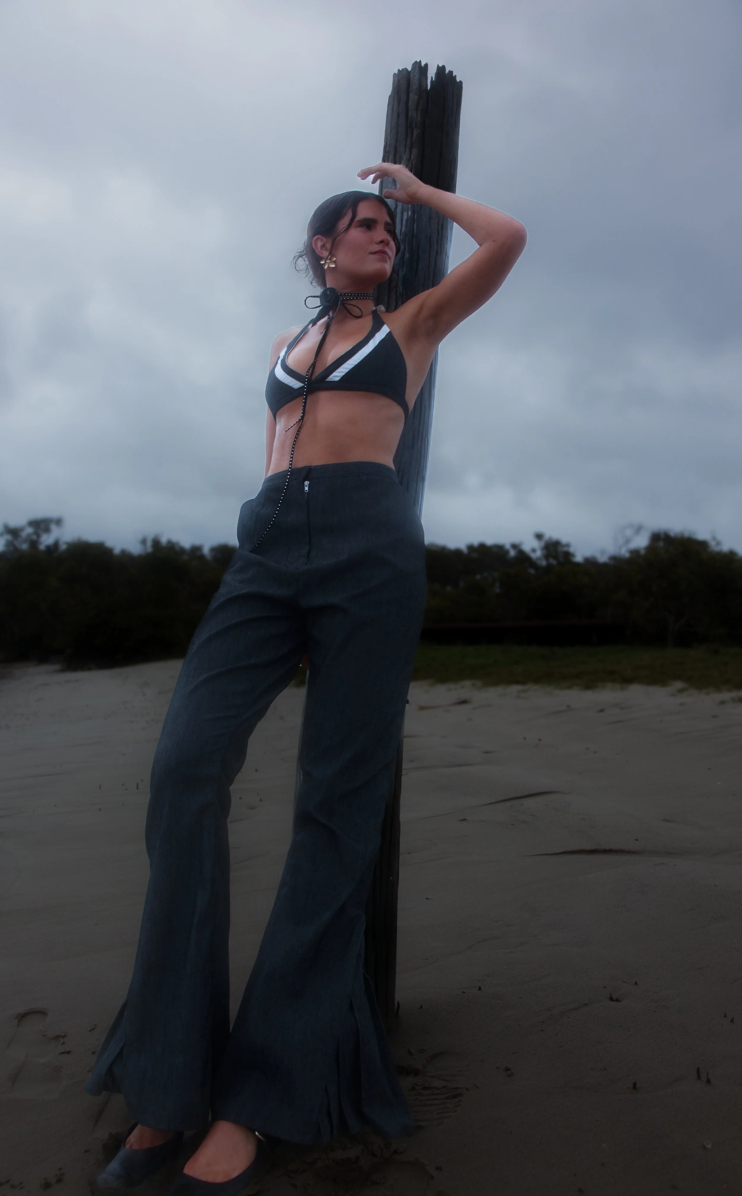
Opposite Ends X Driza-bone
Driza-Bone x Oppositeends is a collaborative micro-collection that repurposes surplus Driza-Bone fabrics to reinterpret and redefine the brand’s outback heritage.
Selected as a ‘Next Gen’ Finalist for the Brisbane Fashion Festival, this micro collection—created in collaboration with Driza-Bone—repurposes surplus fabrics to explore the tension between rugged utility and flamboyant excess. Inspired by rodeo culture, the designs fuse functional details with bold, western-inspired ornamentation, embracing adaptability, movement, and theatrical style.


Details:


Process:

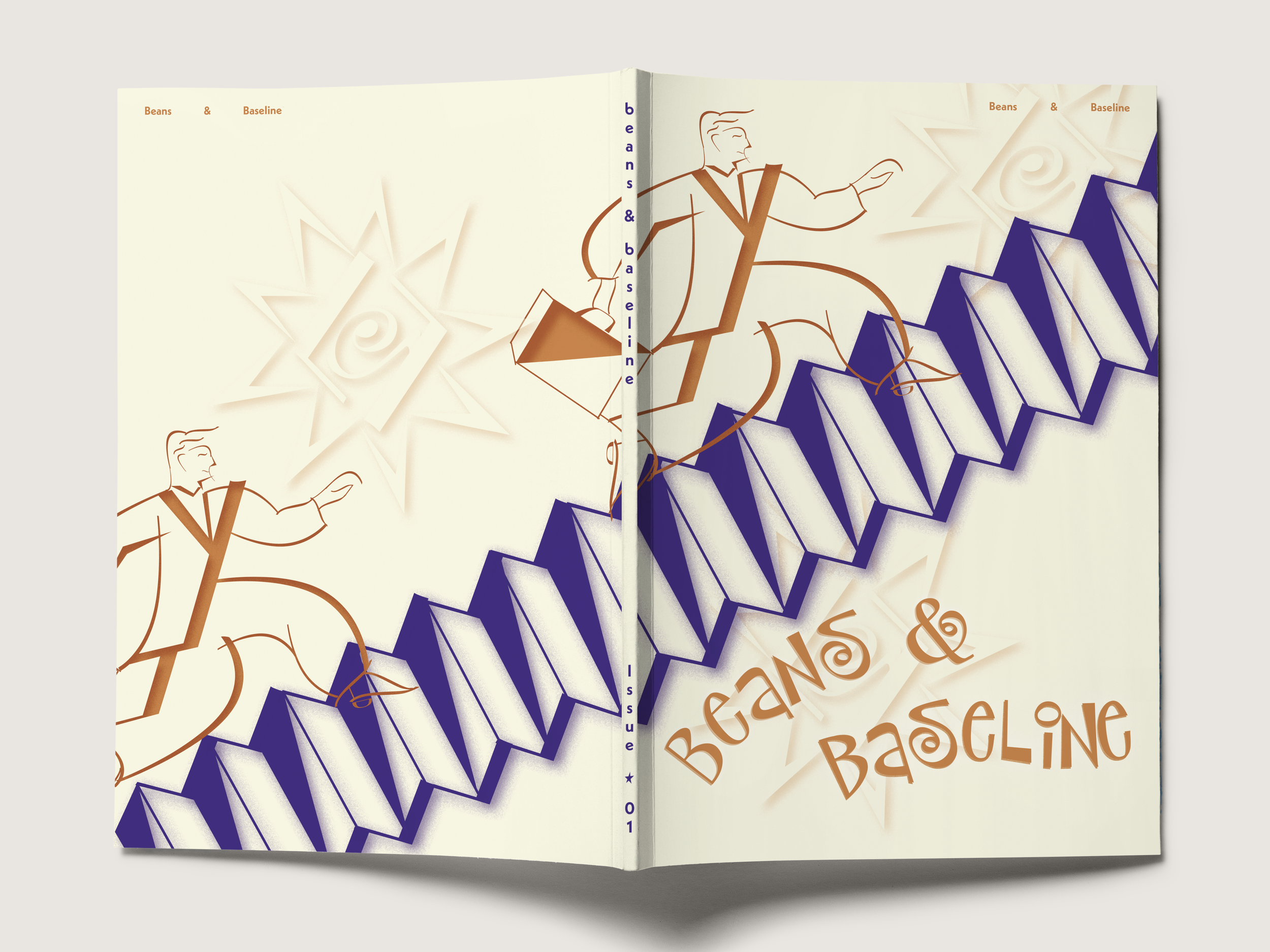
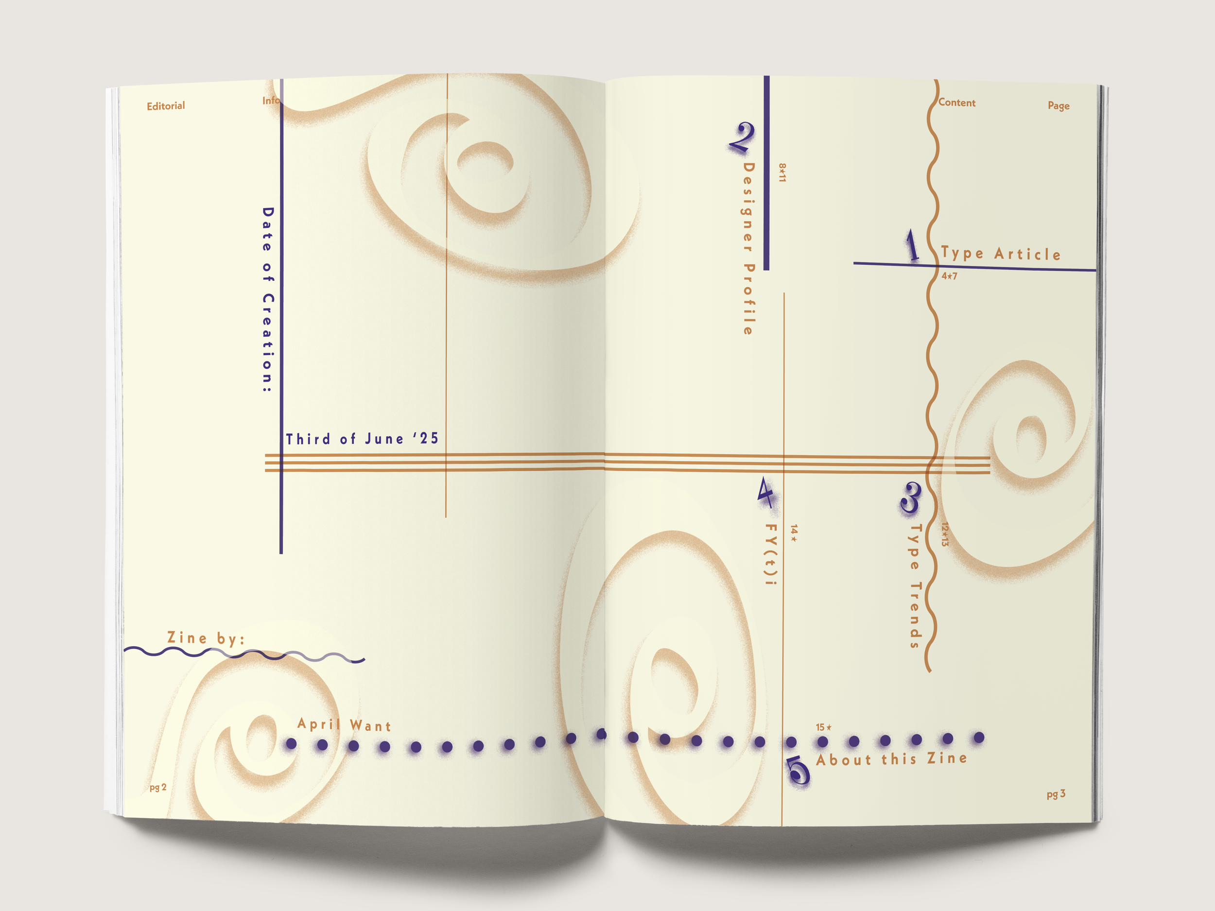
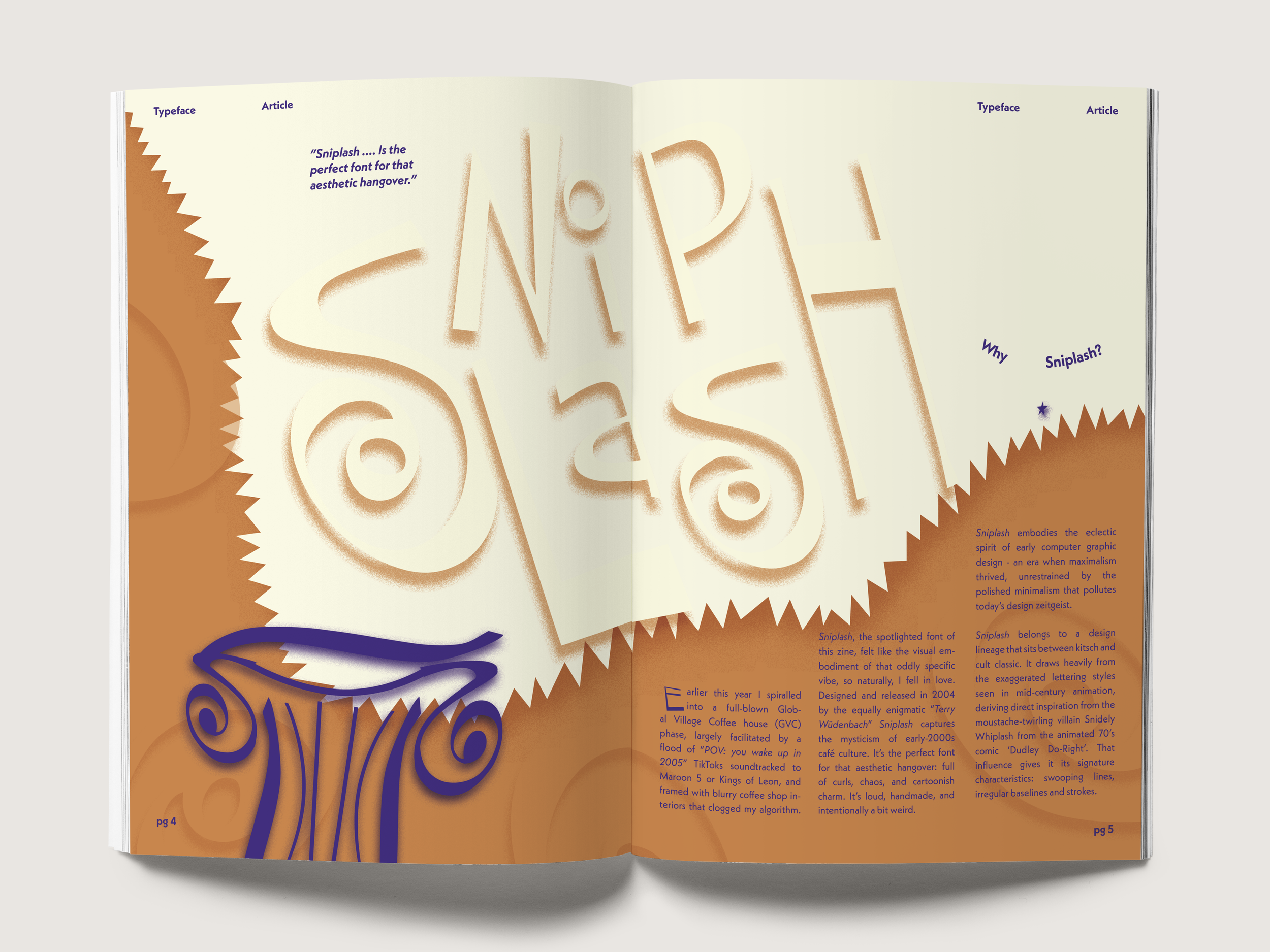
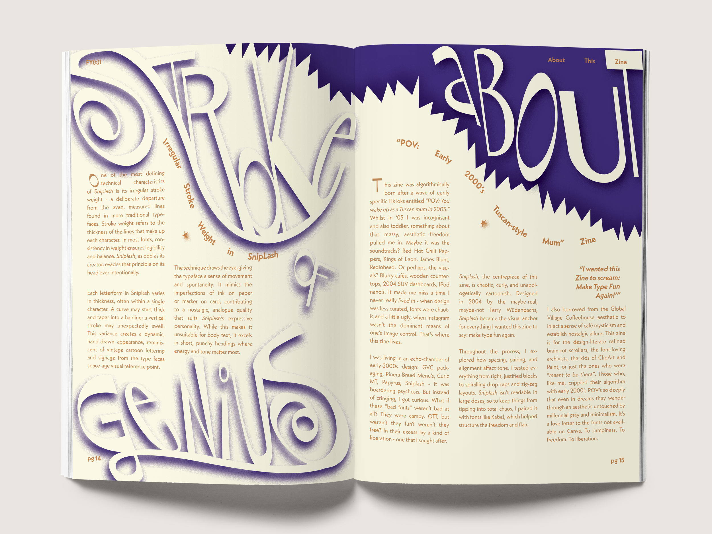
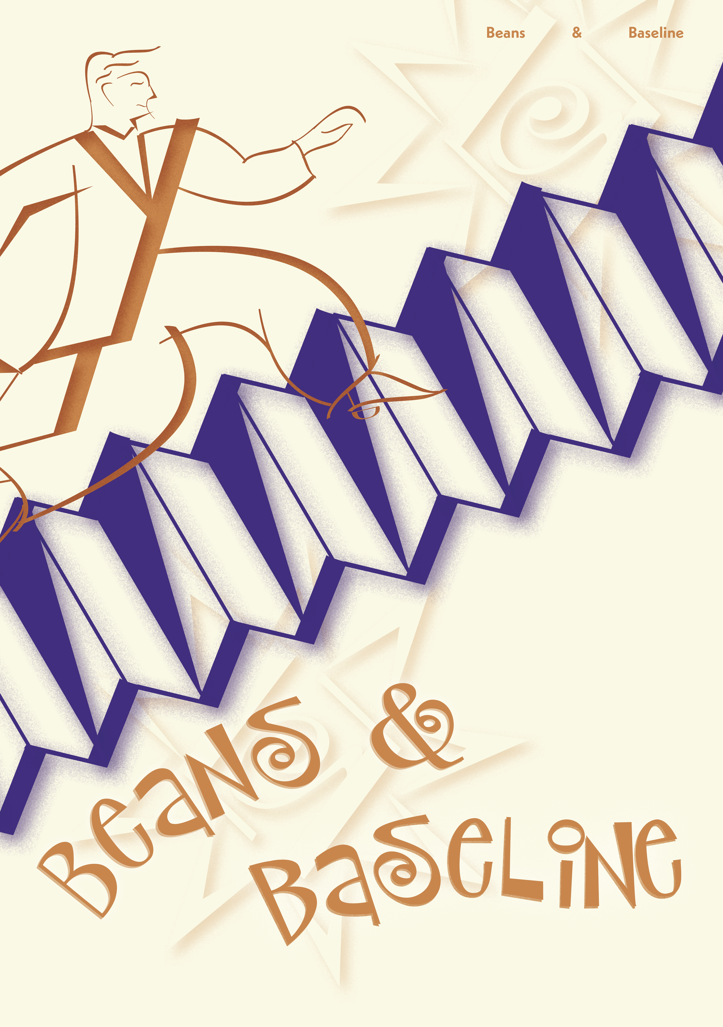
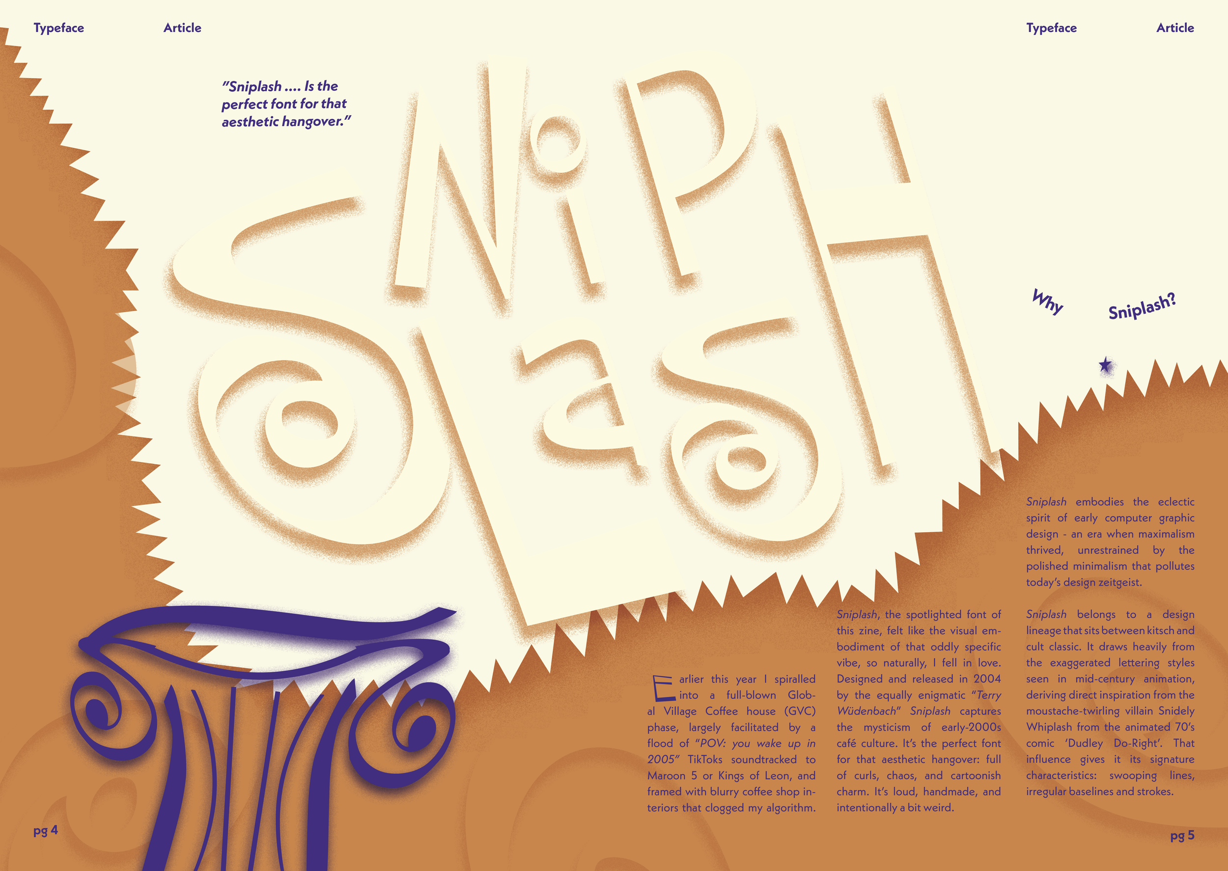
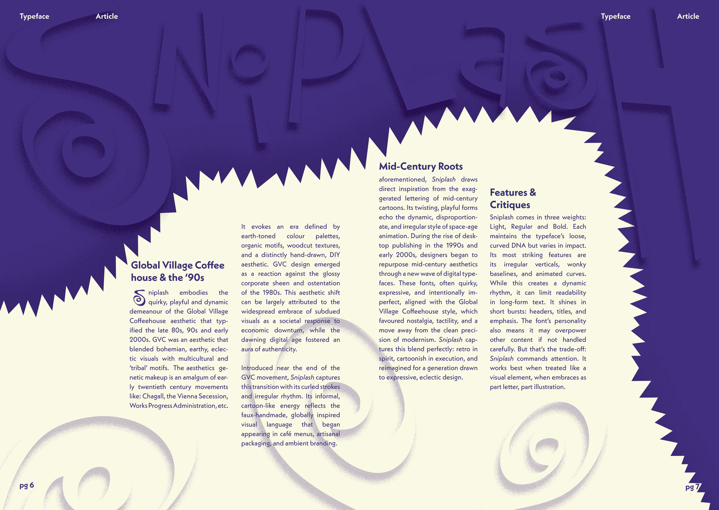
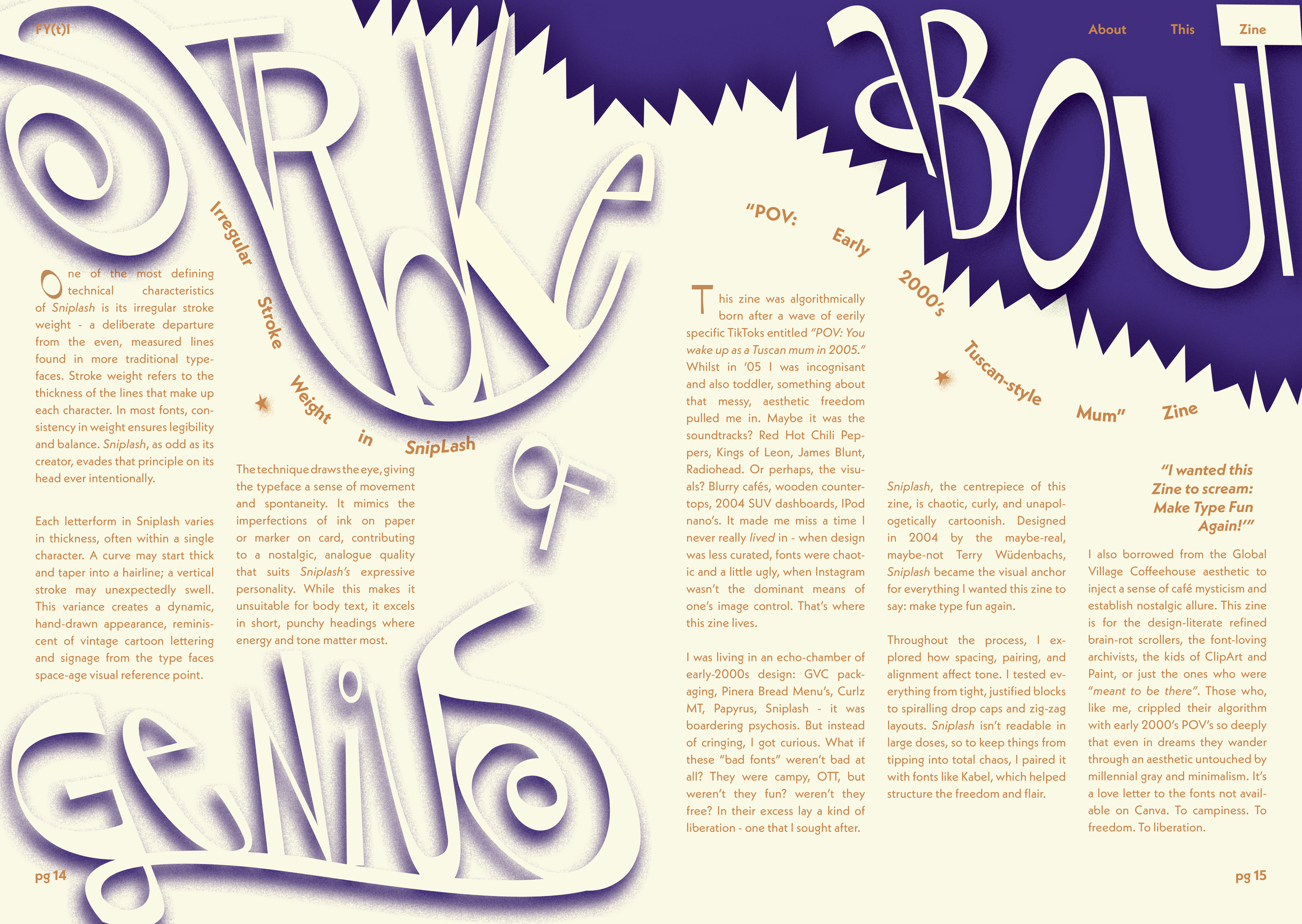
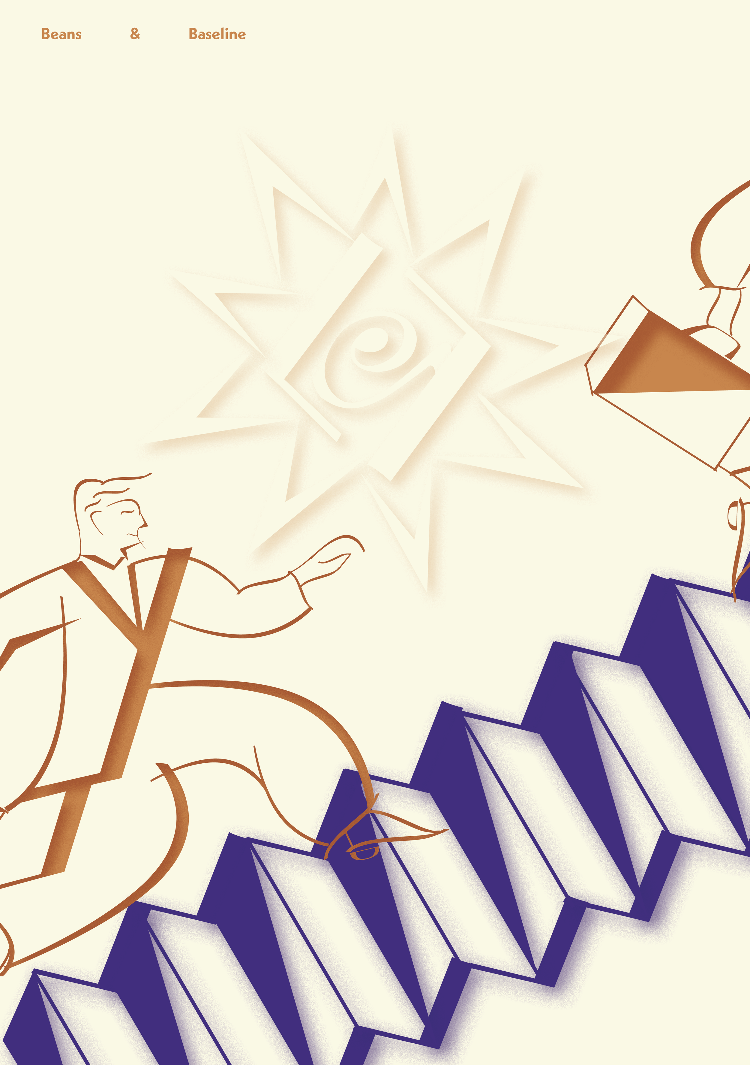
Beans and Baseline Typographic Zine
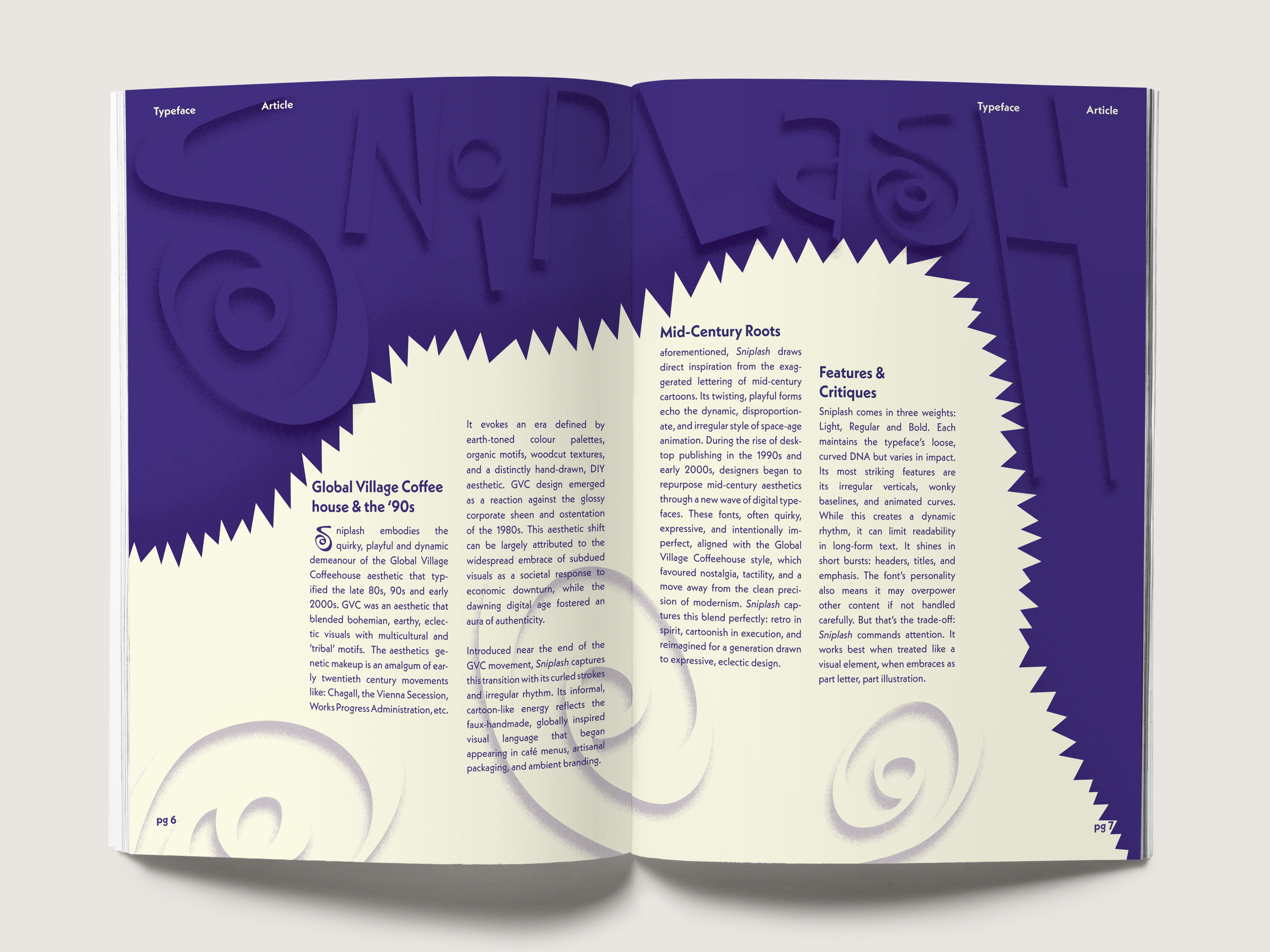
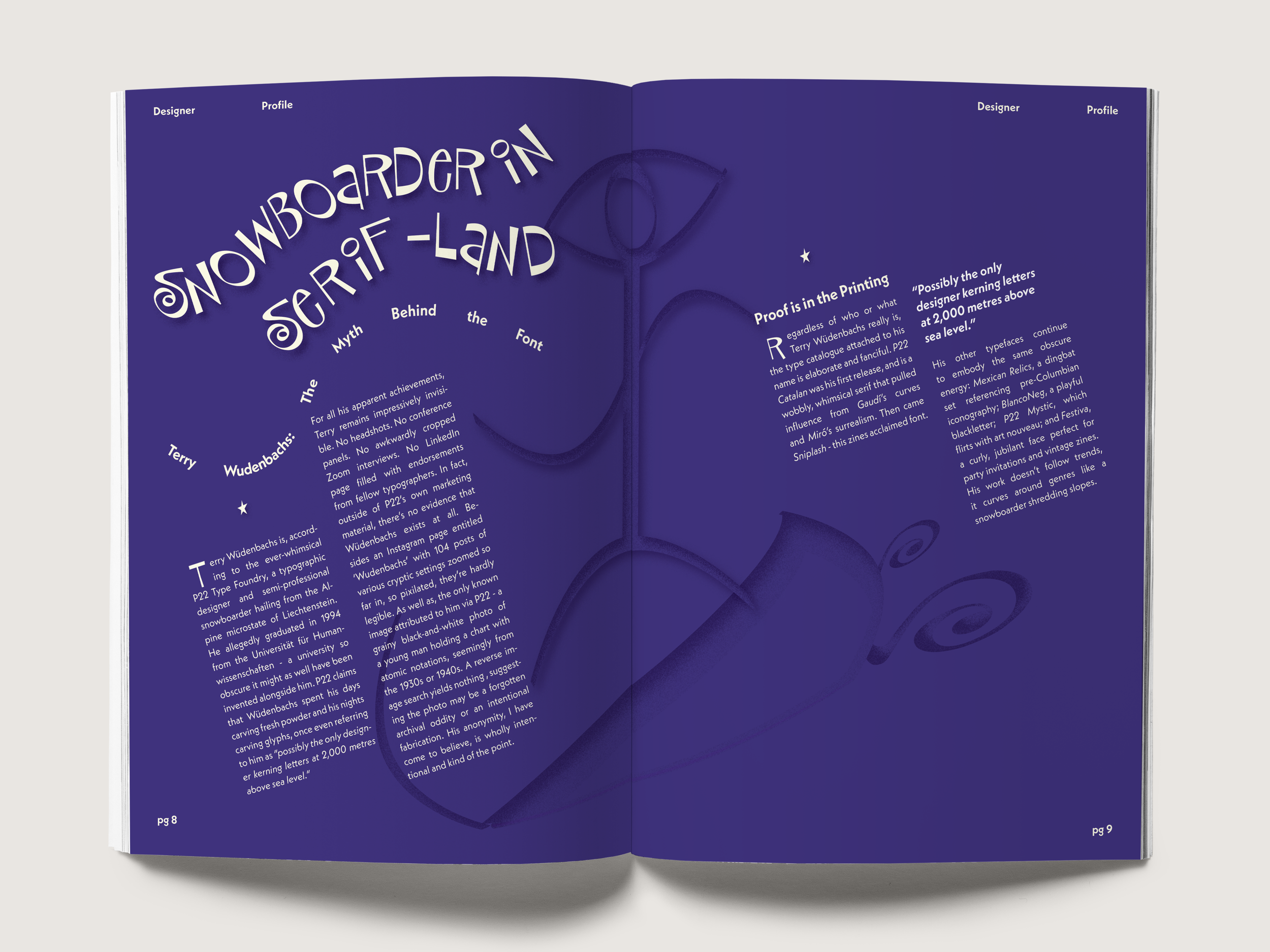
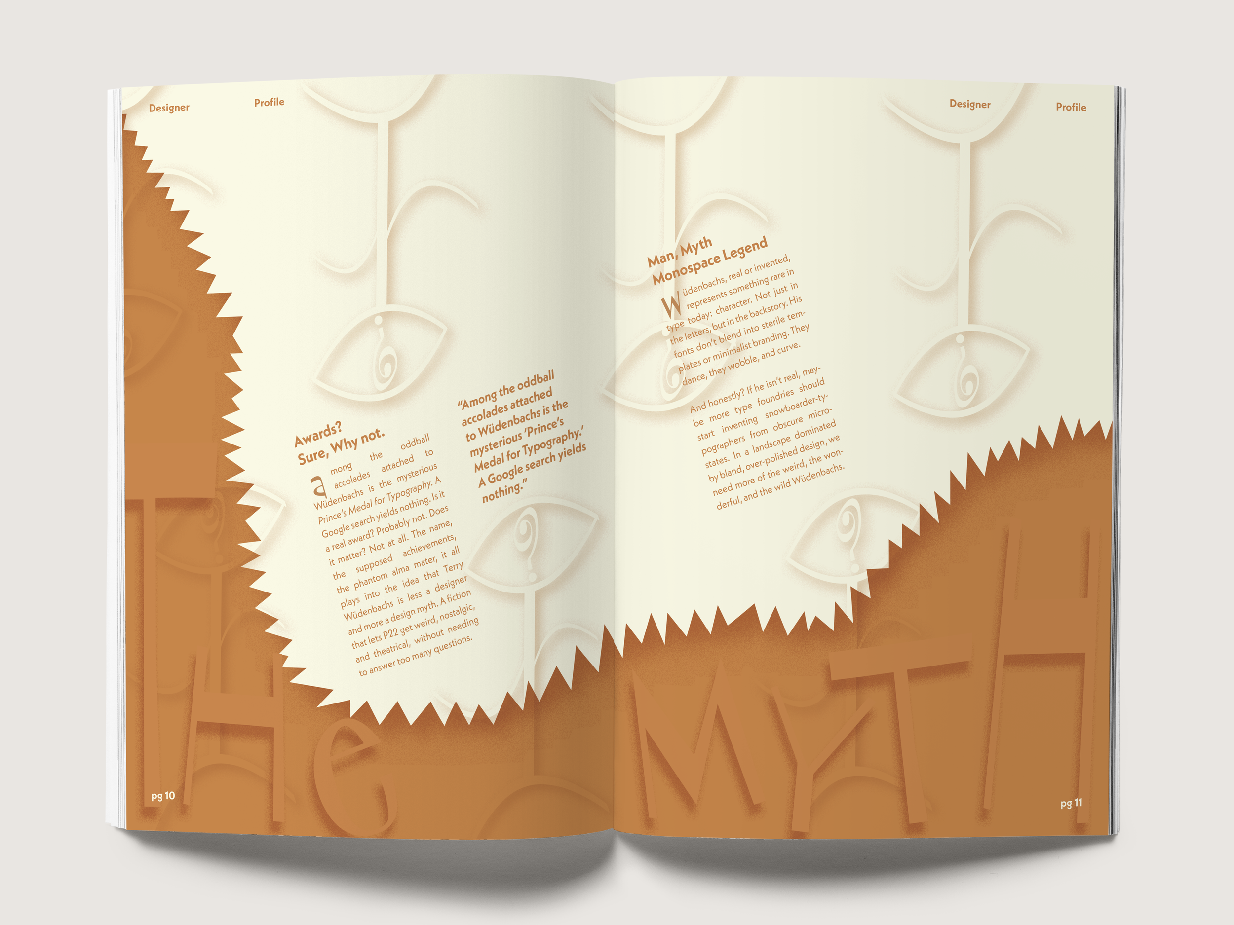
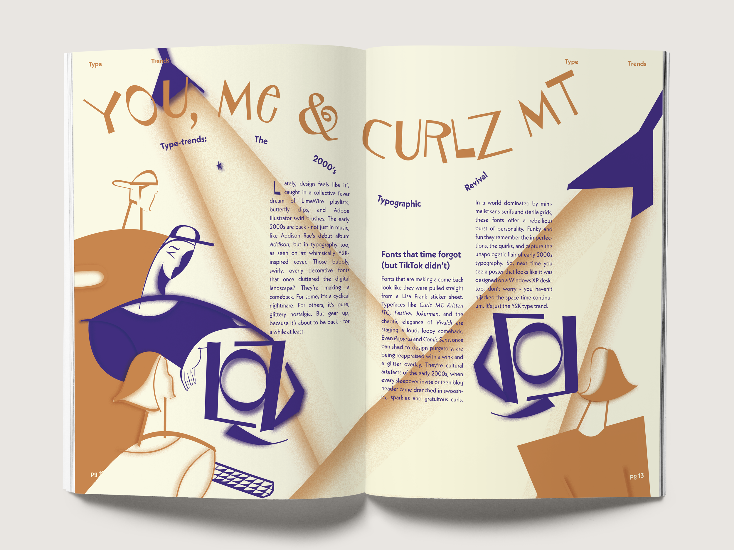
Exploring the Global Village Coffeehouse aesthetic, reimagining 1990s and early 2000s typographic design through a modern, nostalgia-driven context.
‘Beans and Baseline’ is a typographic zine that explores the Global Village Coffeehouse aesthetic, reimagining 1990s and early 2000s typographic design through a modern, nostalgia-driven lens. In line with the project’s brief, all illustrative elements within the zine are crafted exclusively using its featured typeface, ‘SnipLash’. The design employs only two additional colours alongside the cream-toned paper, reinforcing its minimal yet expressive visual identity.


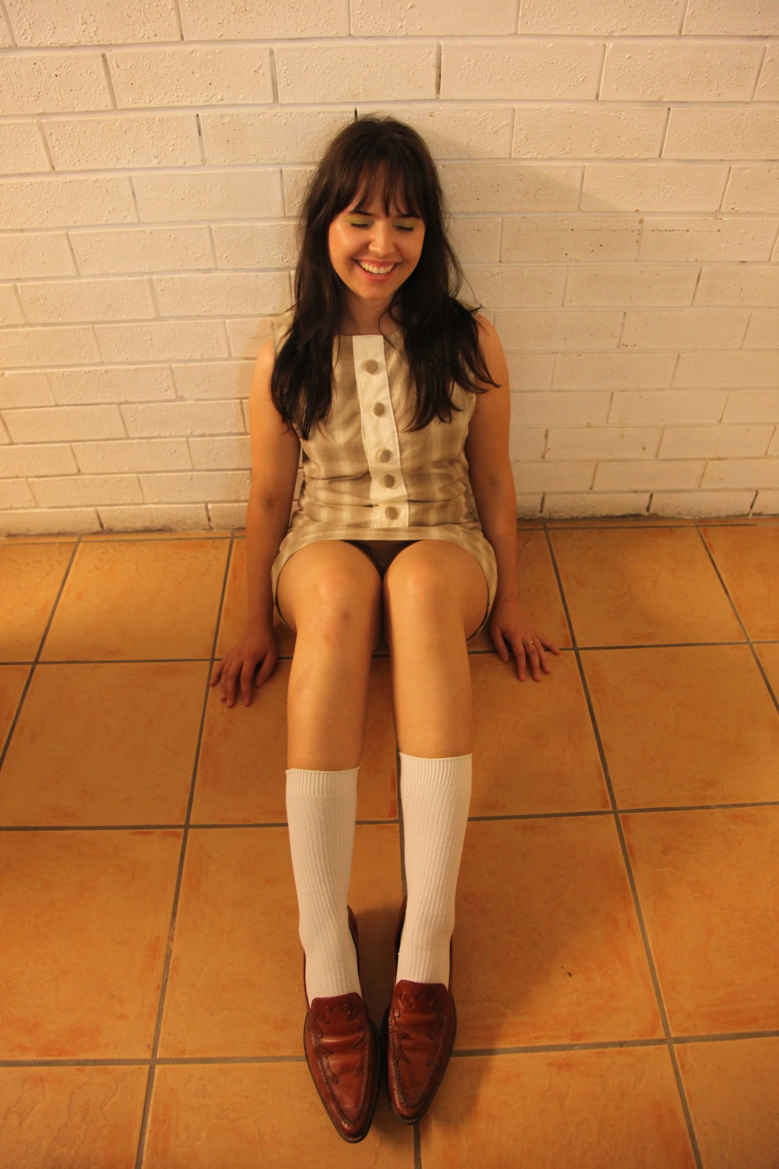
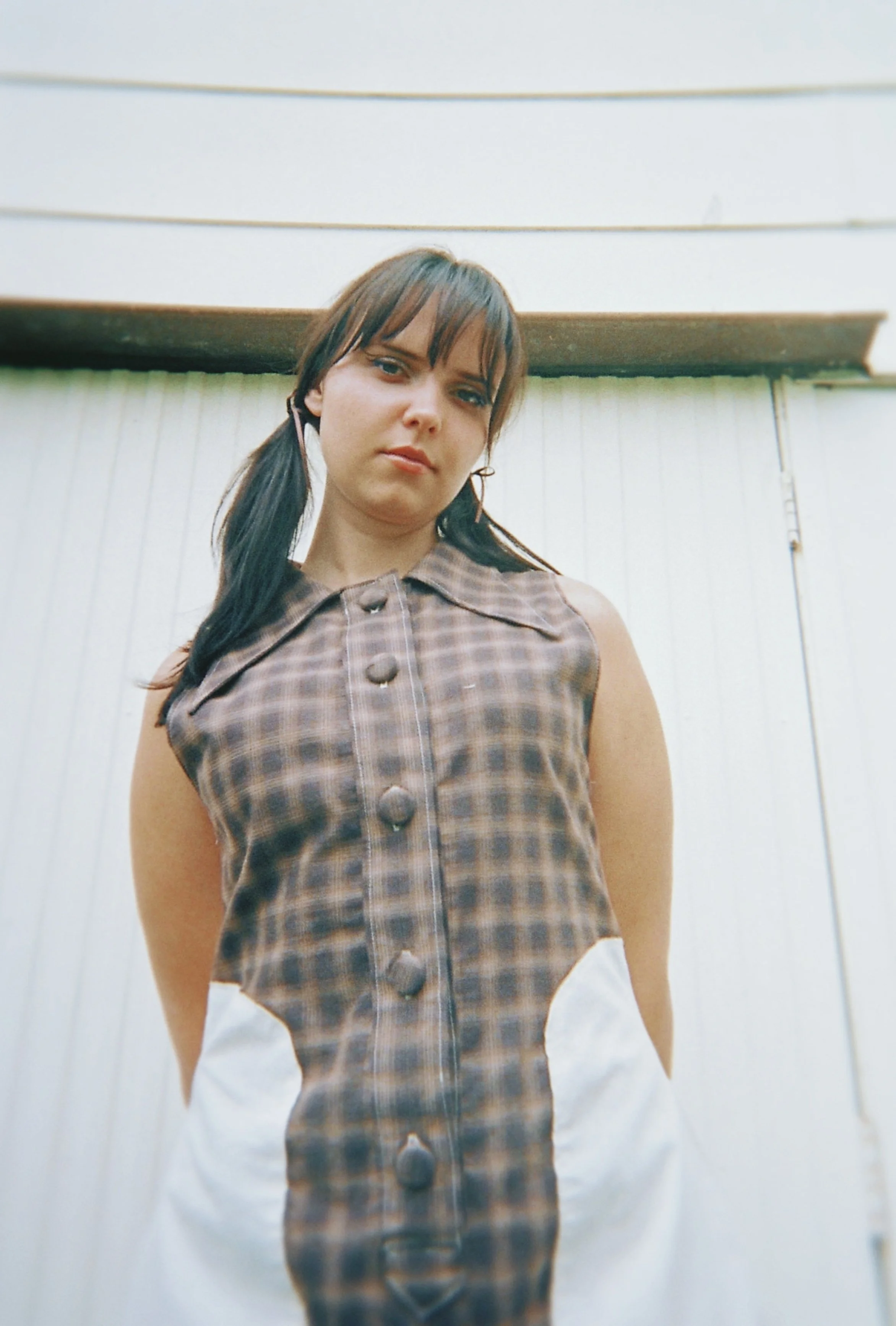
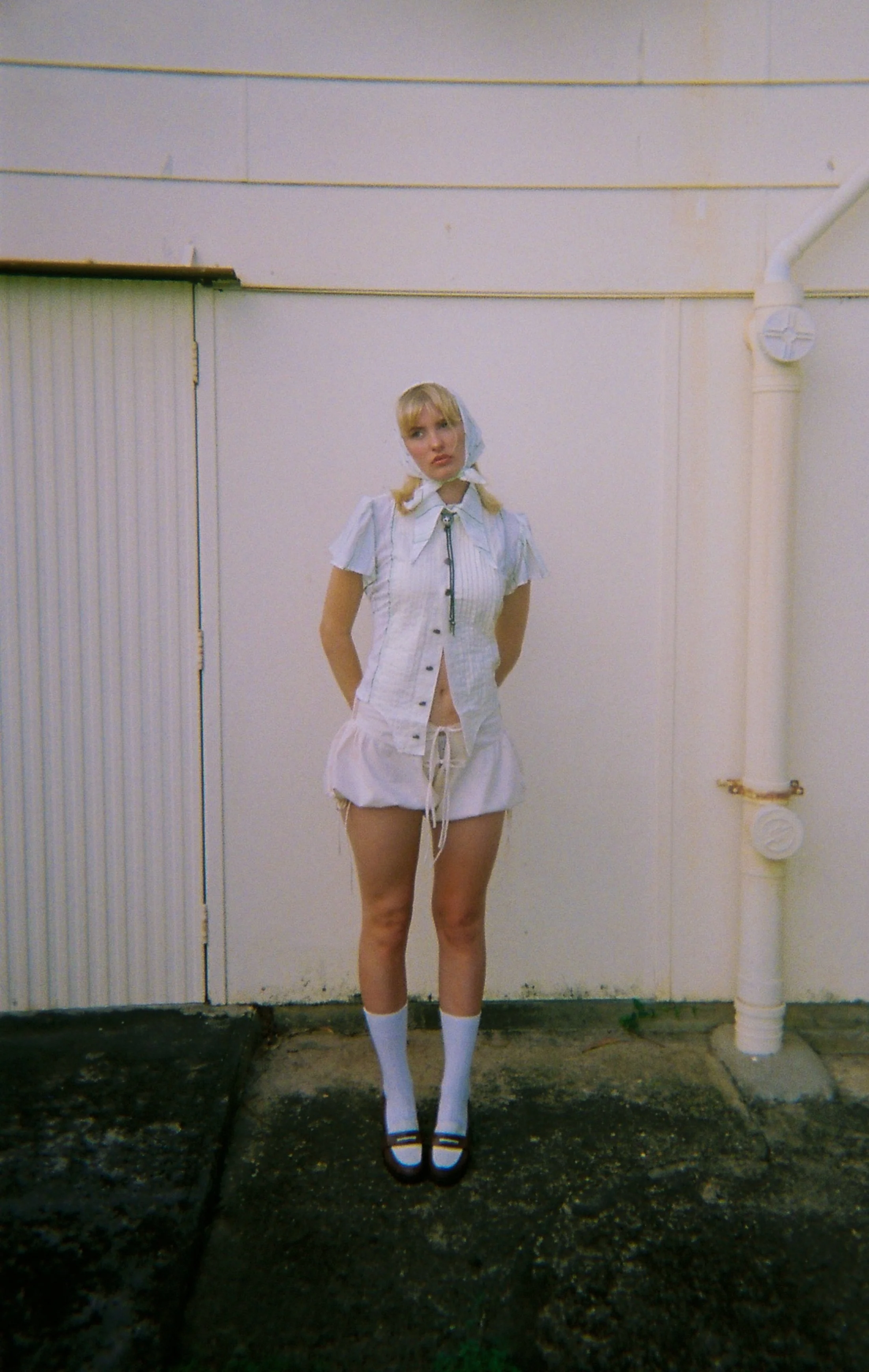
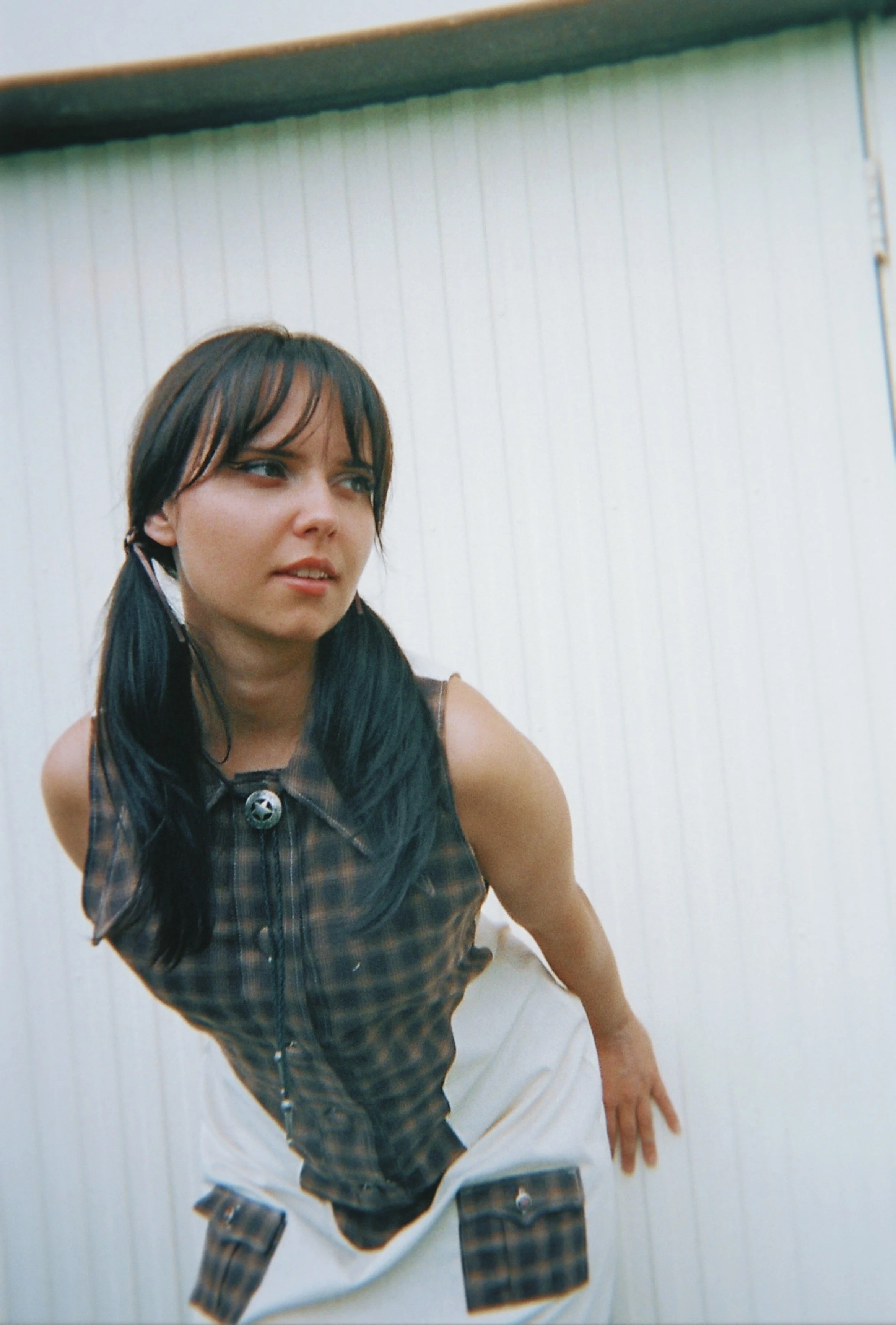
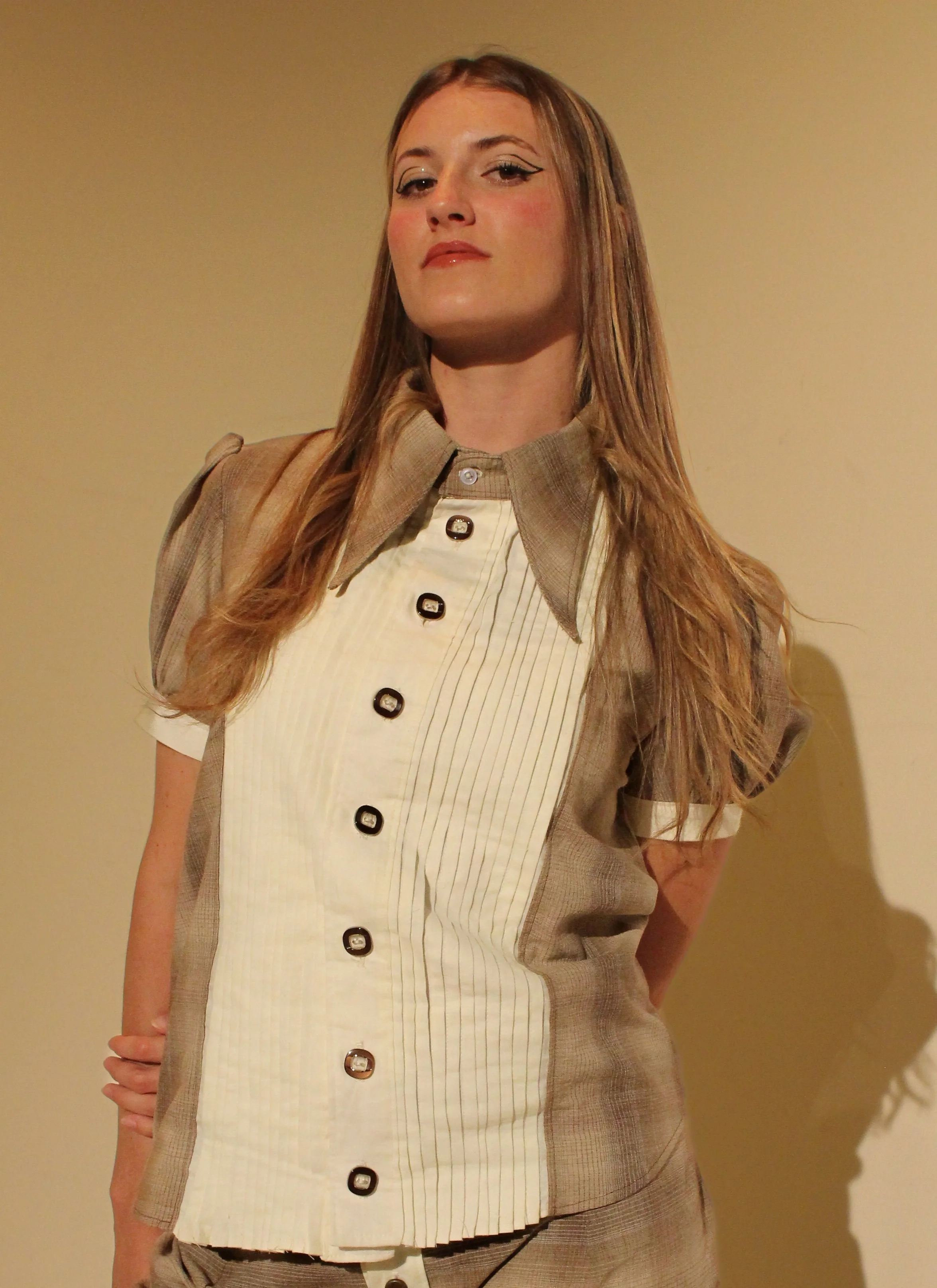
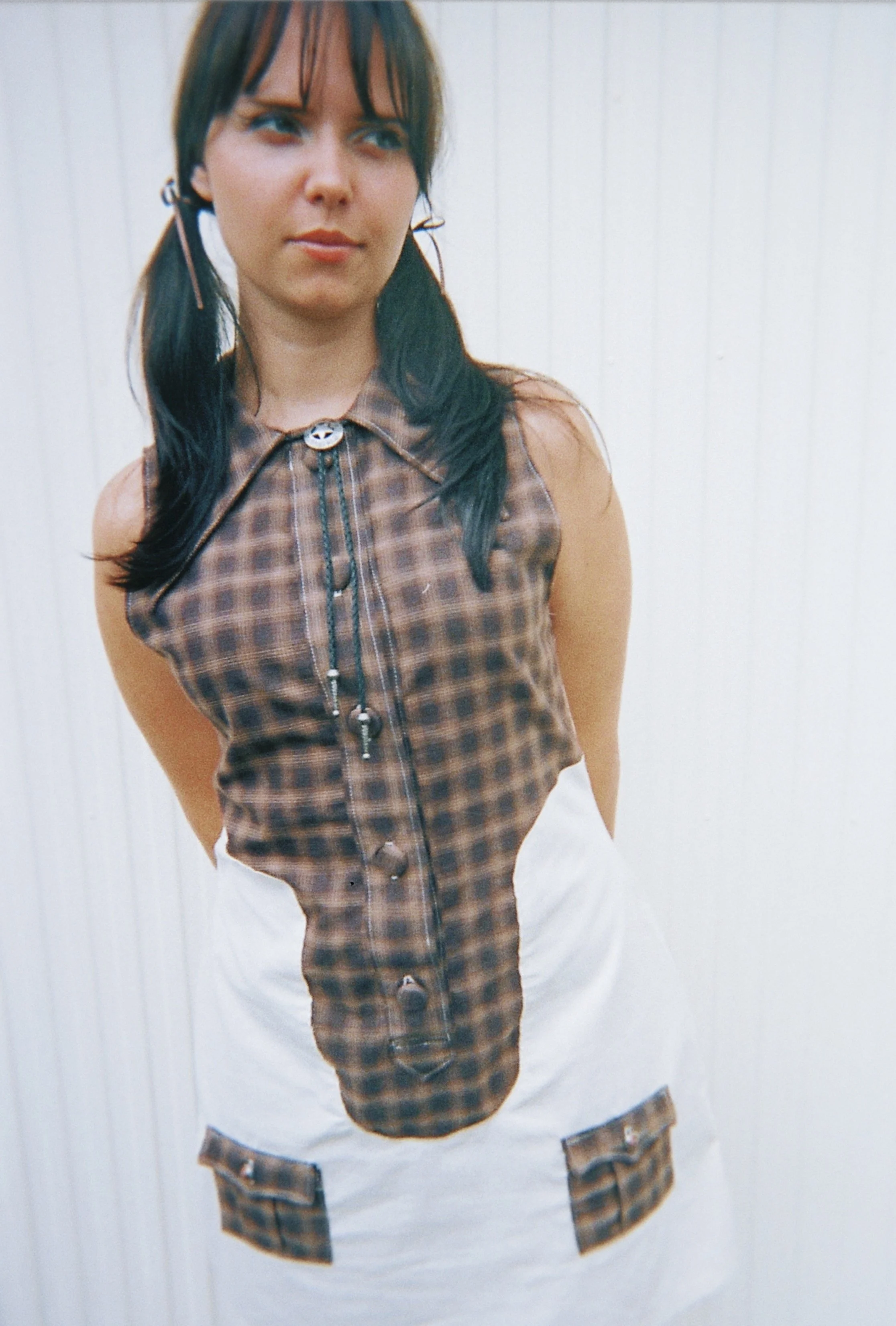
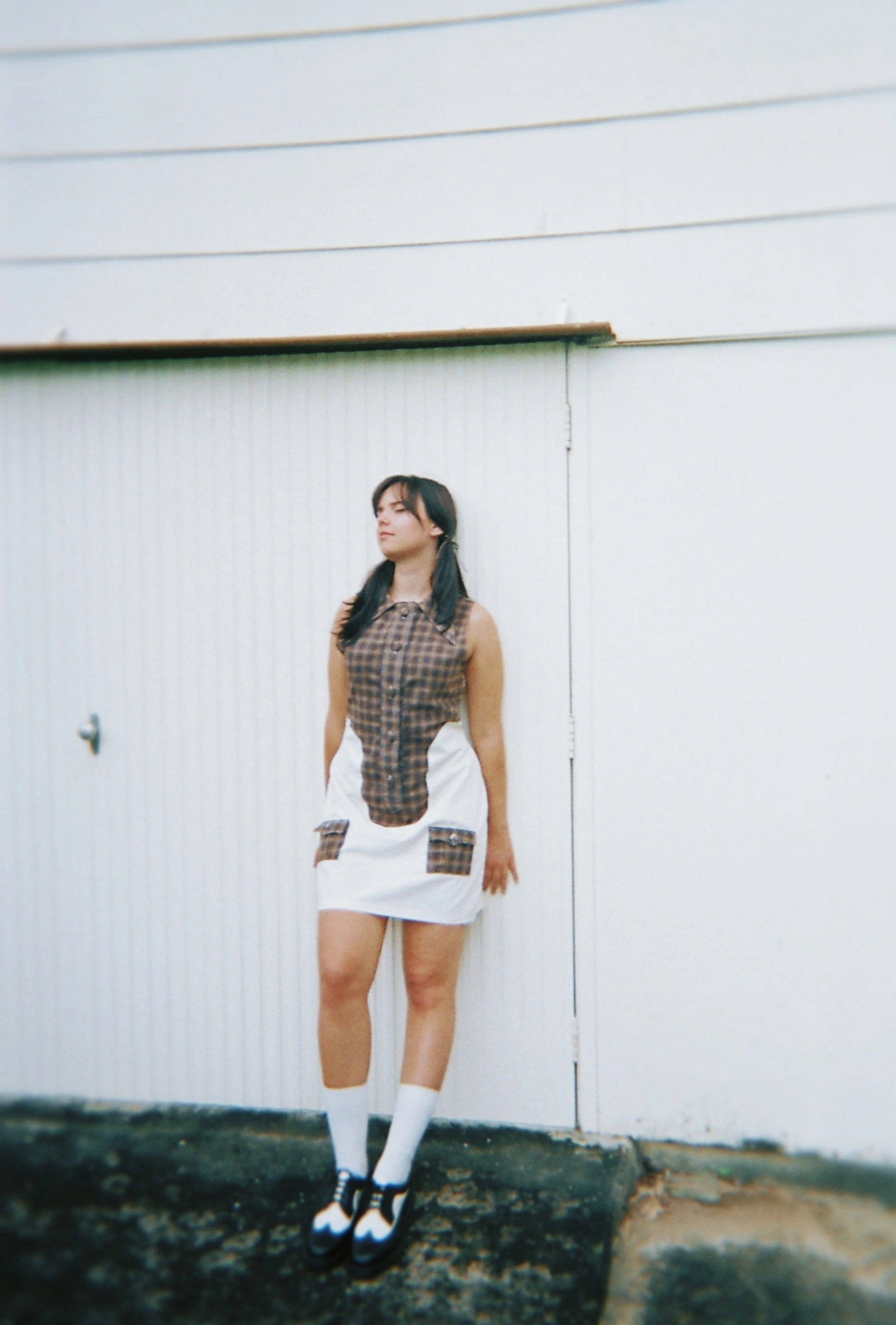
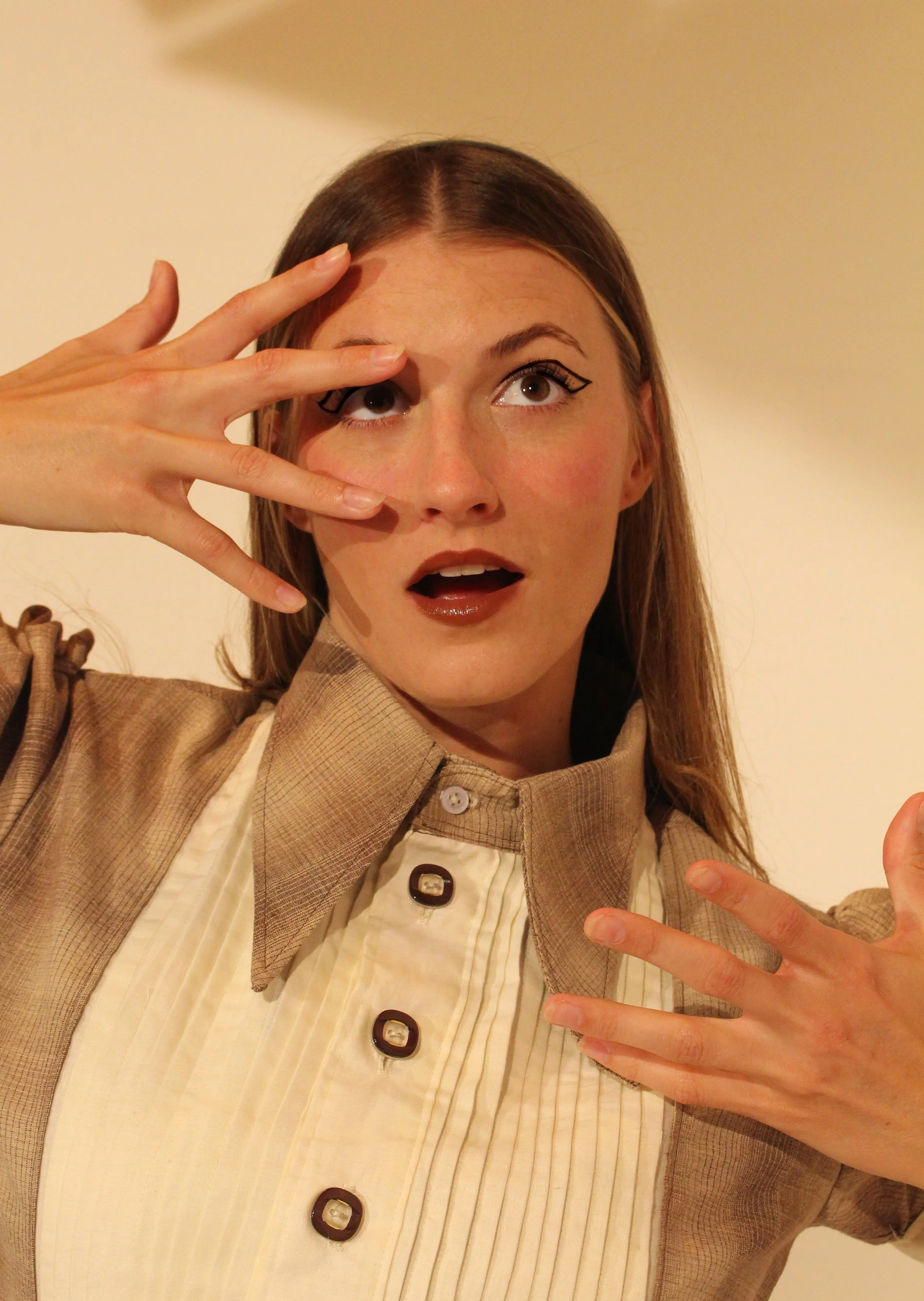
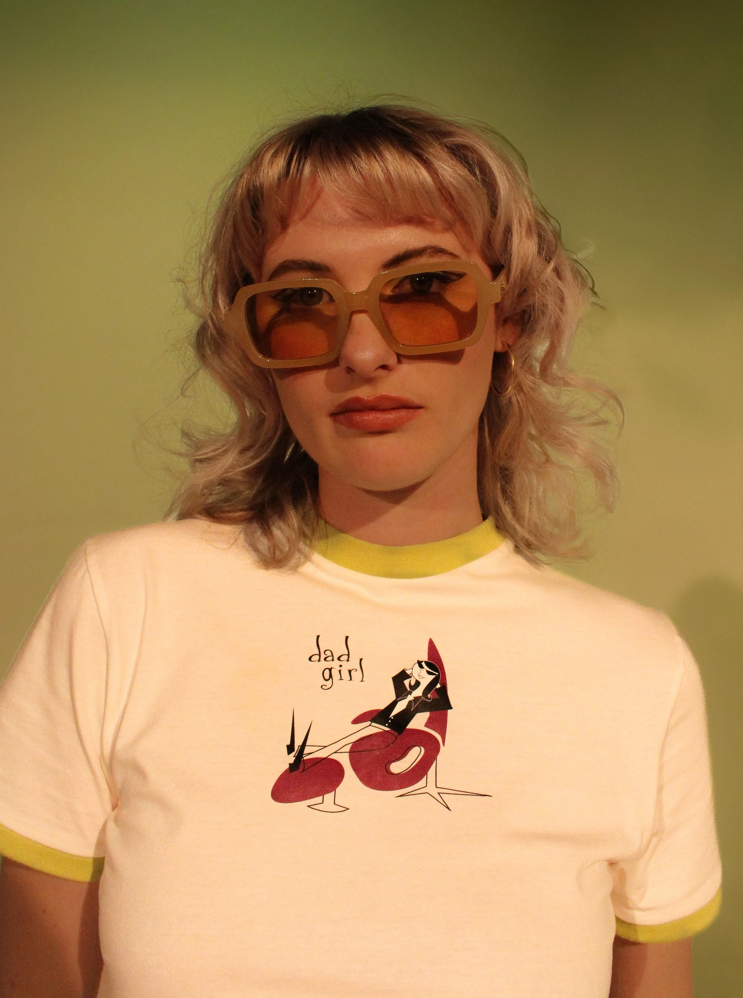
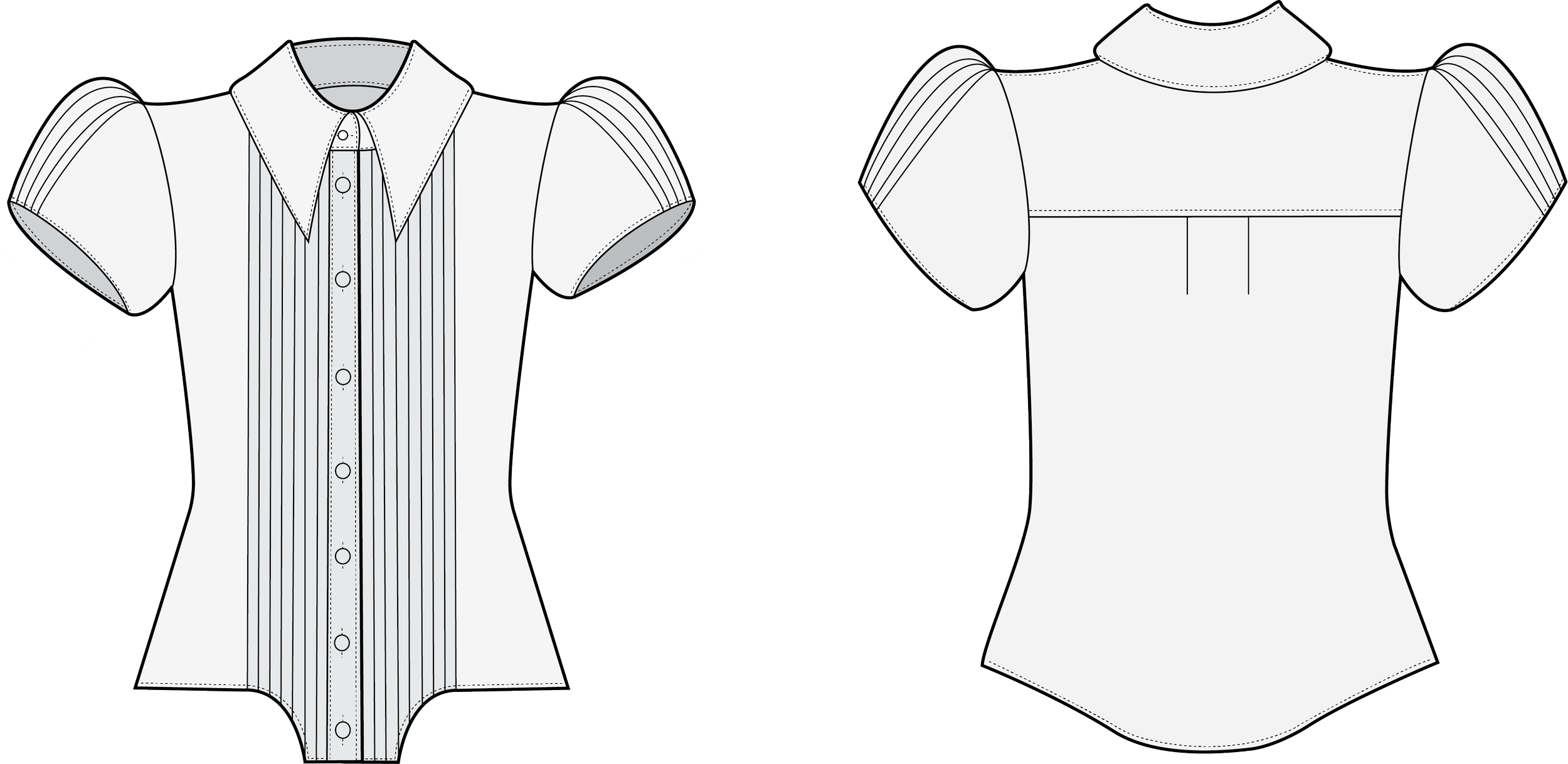
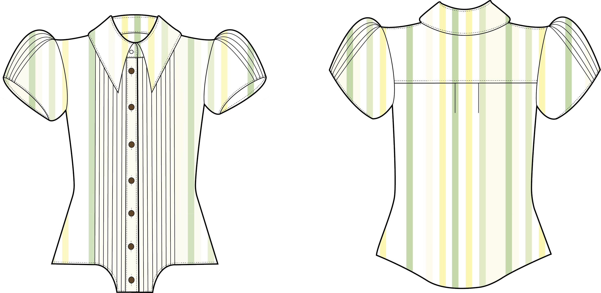
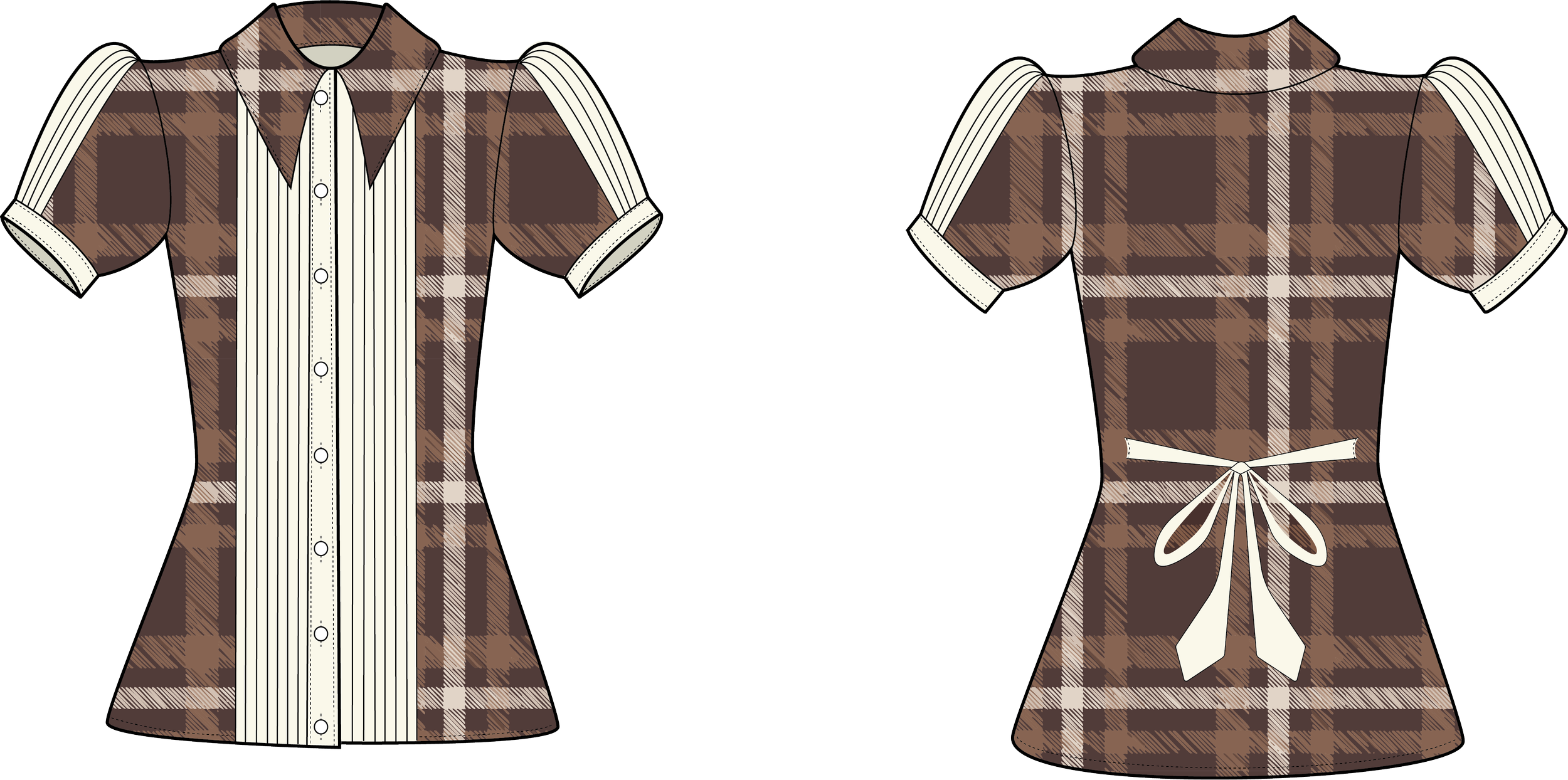
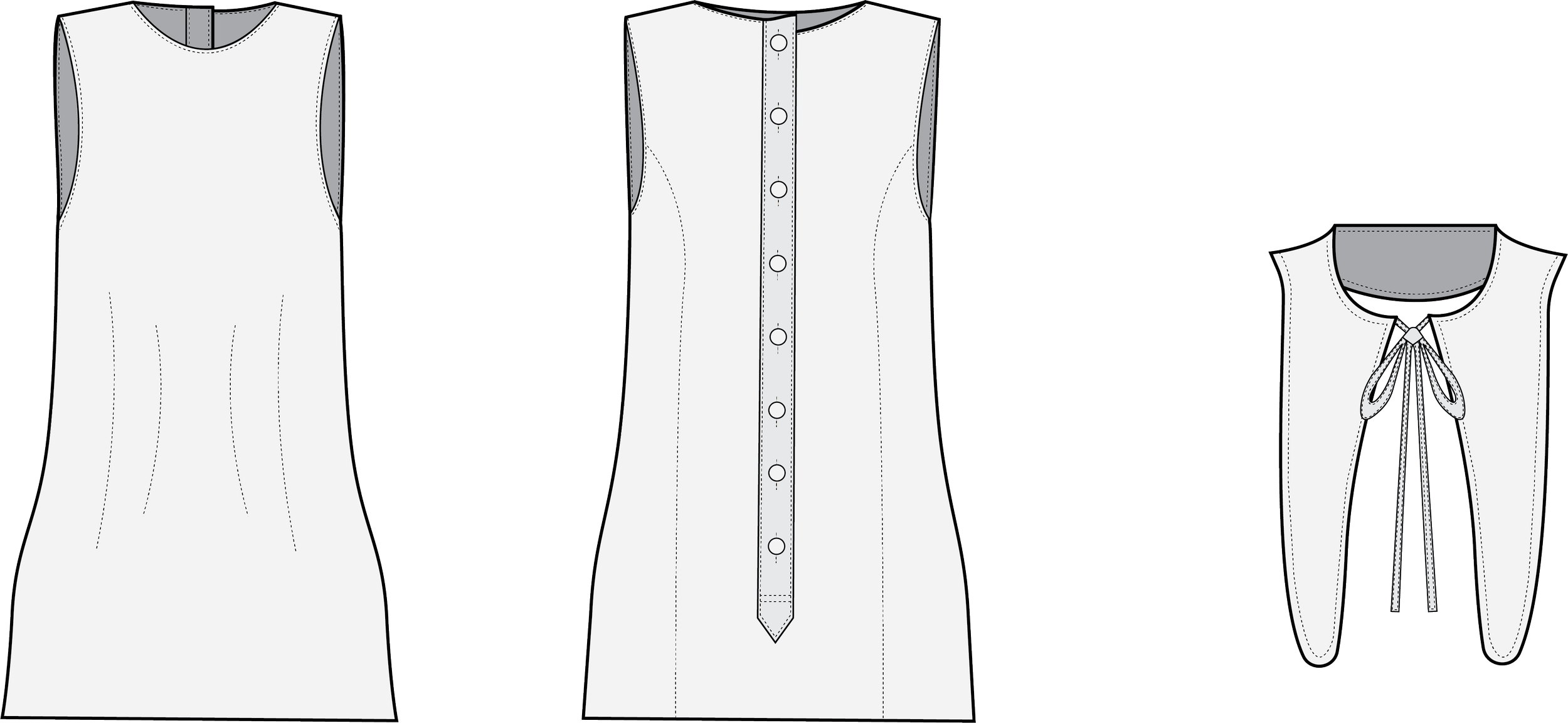
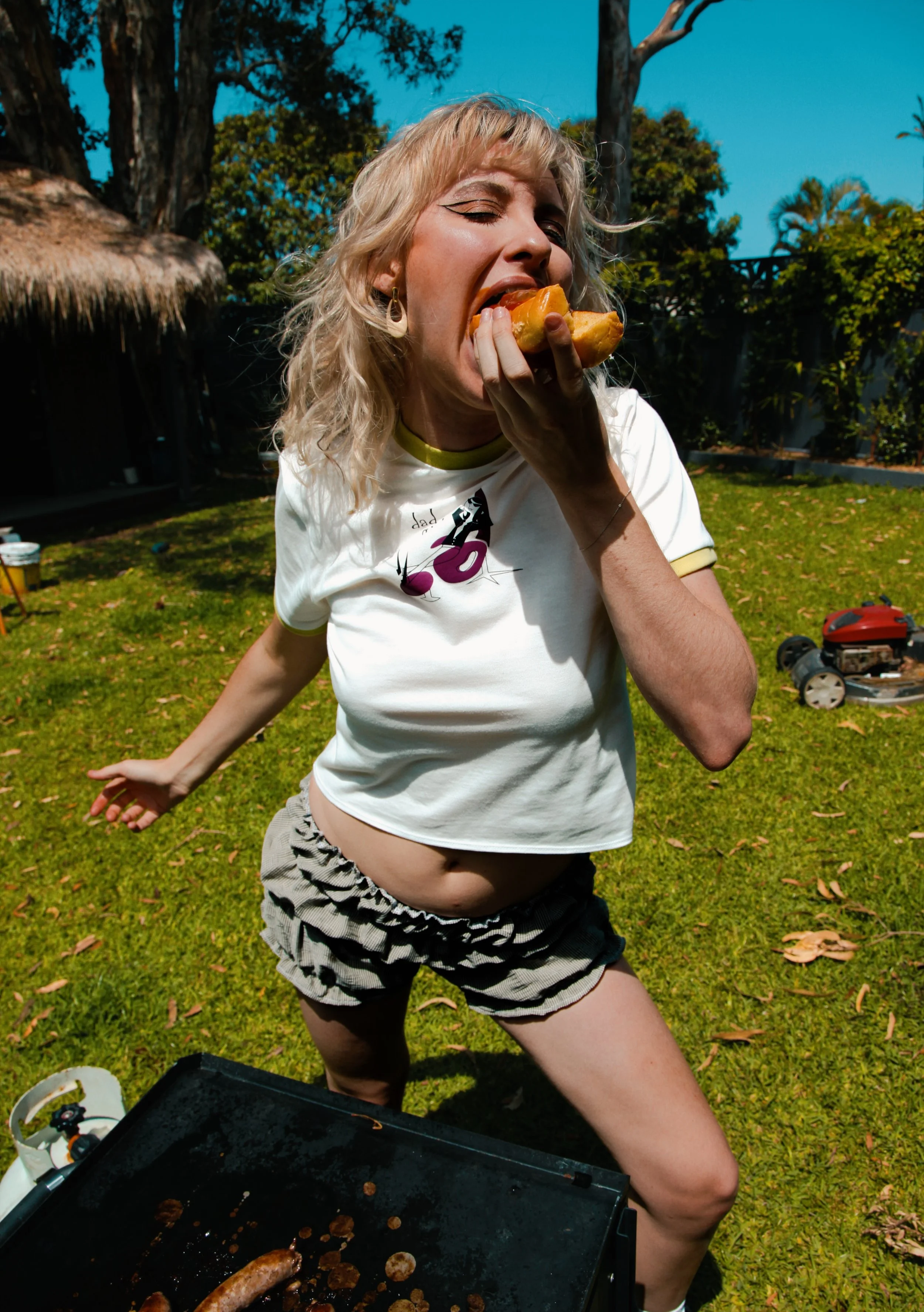
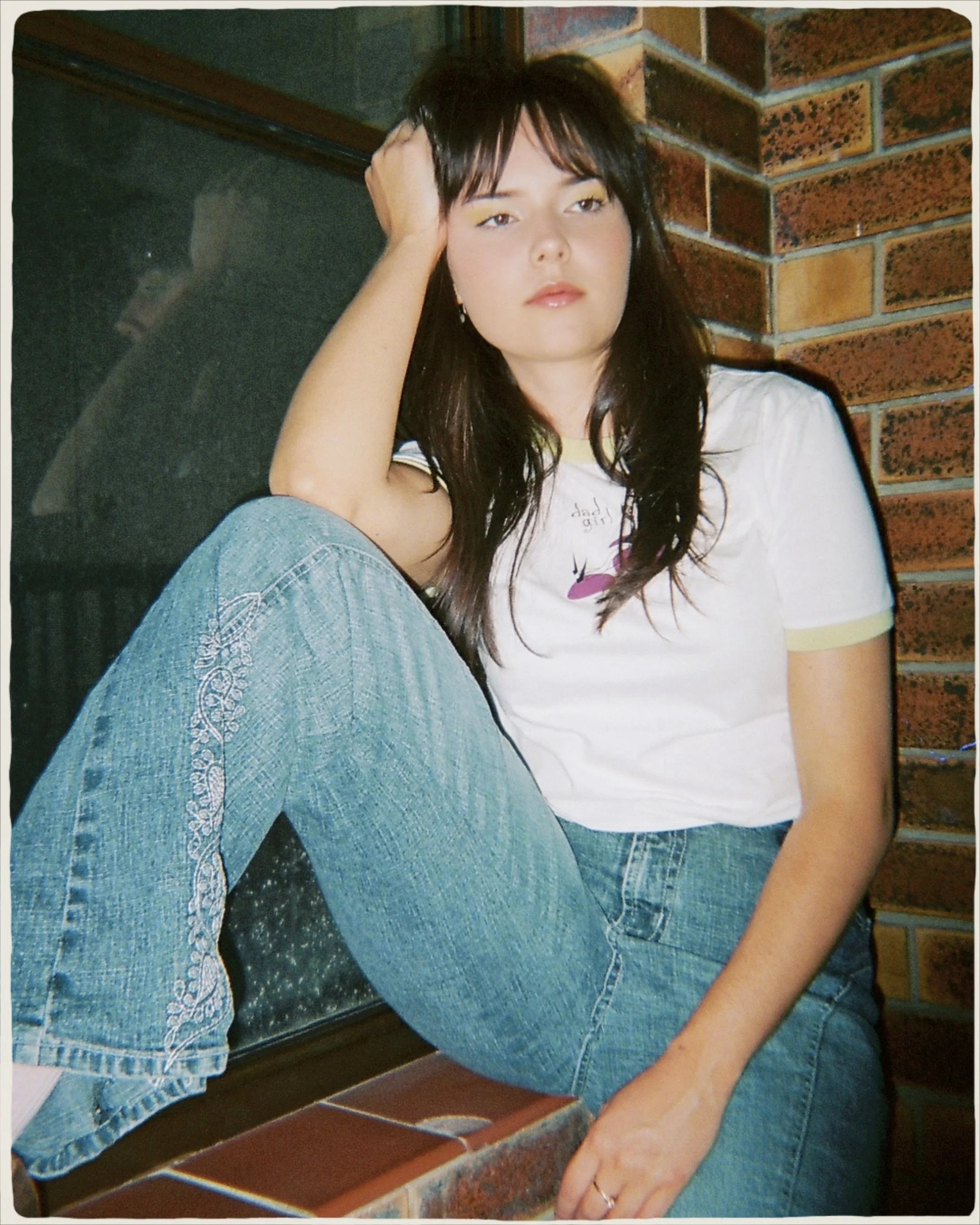
GirlDad Capsule Collection Launch
A gender-bending mix of nostalgic “dad” wear, this collection fuses reclaimed materials with mid-century and Western influences to subvert traditional style codes.
Blending mid-century modern, 1960s Mod, and 1970s Western Americana, this collection reimagines traditional “dad” garments through the use of reclaimed deadstock and upcycled shirting. Masculine-coded elements like plaid shirts and structured collars are reworked with gathered sleeves, tuxedo plackets, and exaggerated 70s-inspired silhouettes. By fusing masculine and feminine aesthetics, the collection satirises patriarchal binaries and exposes the contradictions embedded in nostalgic style codes.


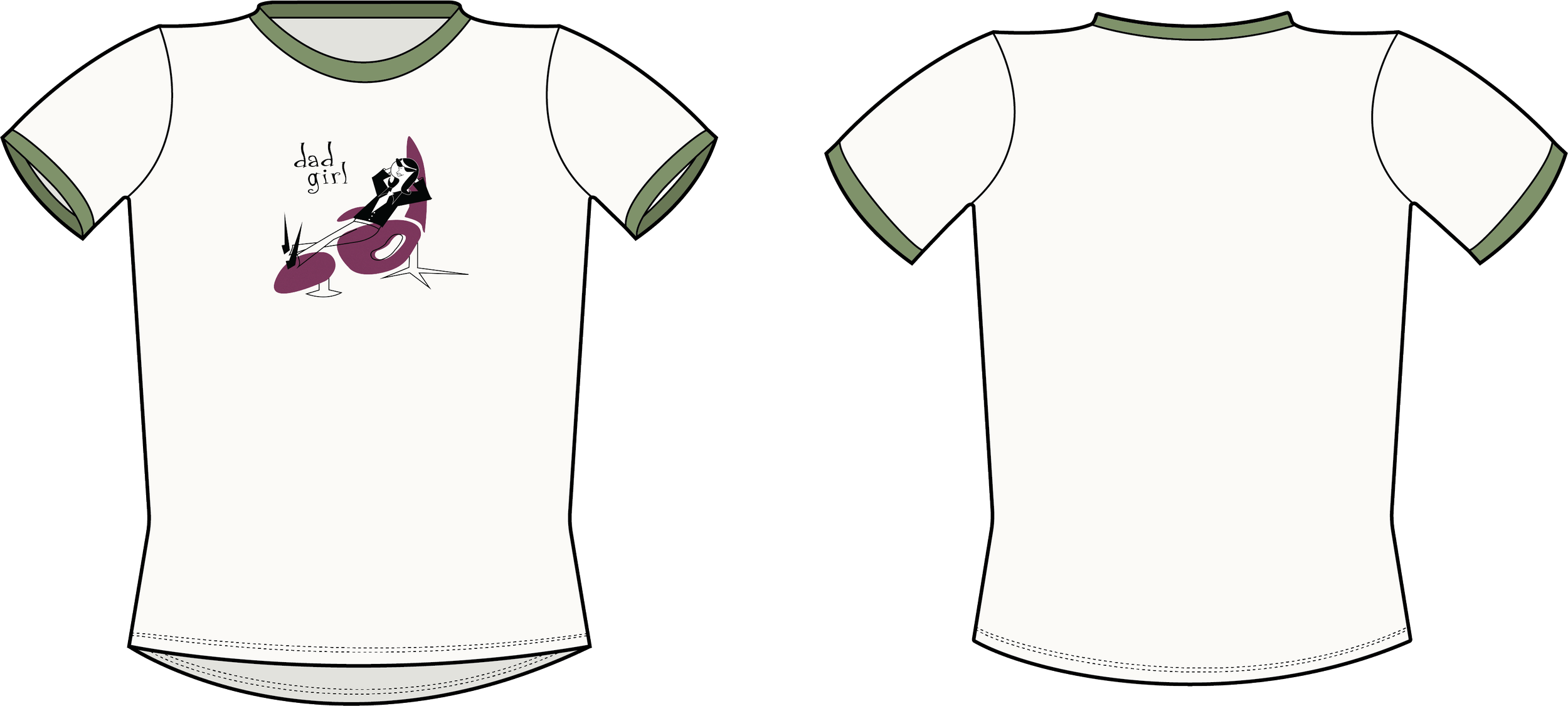
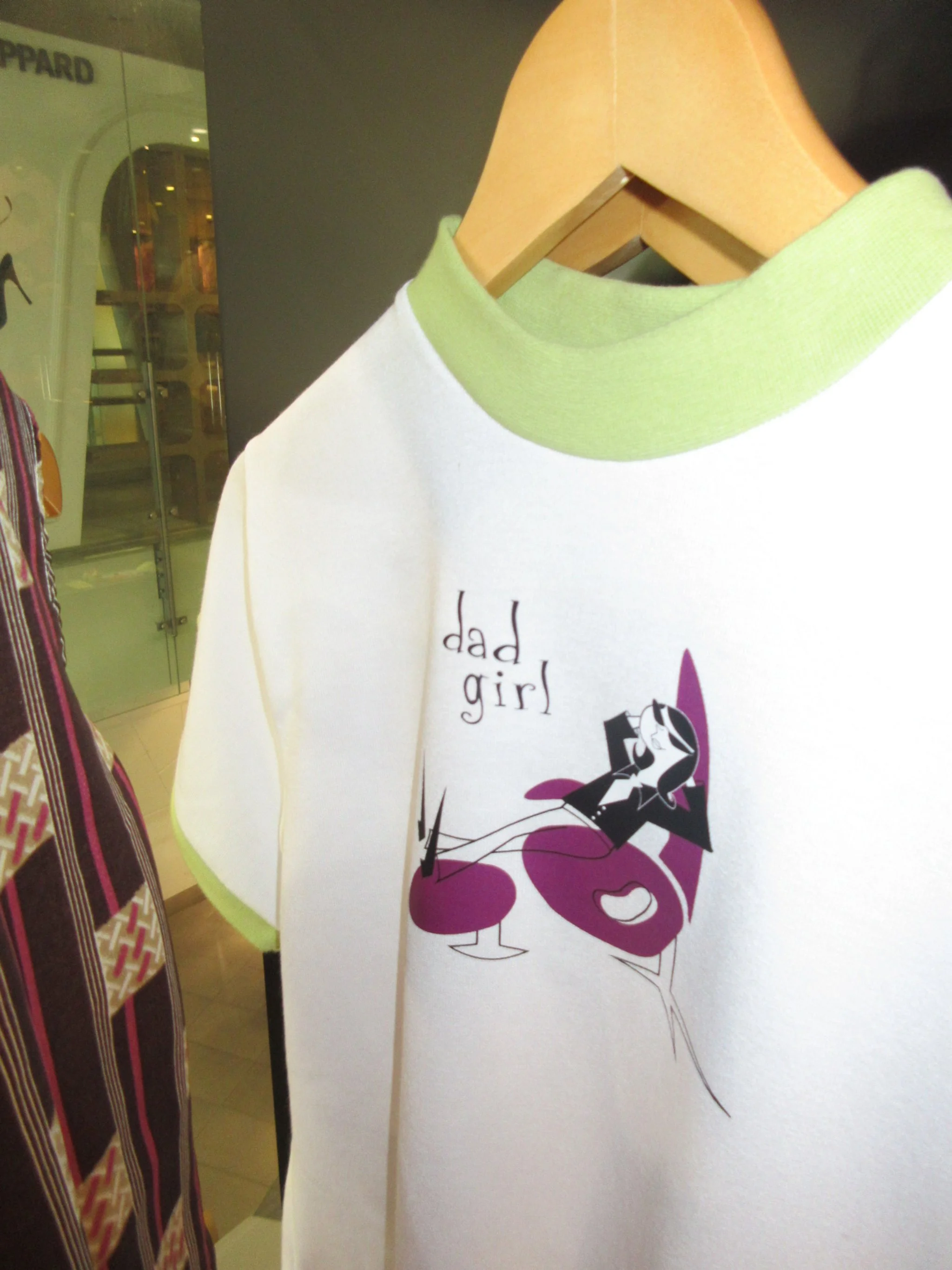
‘Girl Dad’ Graphic Design
Drawing from Mid-century, Googie, and political influences, this blog delves into the graphic design behind GirlDad’s commercial capsule collection.


This T-shirt illustration draws from a confluence of retro-futurist and Googie style aesthetics, encapsulating the ironic and subversive spirit of the ‘DadGirl’ concept.


My Brand, Opposite Ends, is a satirical exploration of the contradictions that shape and define our world. It’s horseshoe logo, inspired by the political Horseshoe Theory, which suggests that the political extremes of left and right are not diametrically opposed but rather converge or resemble each other, reflected the brand’s focus on duality and opposing extremes.

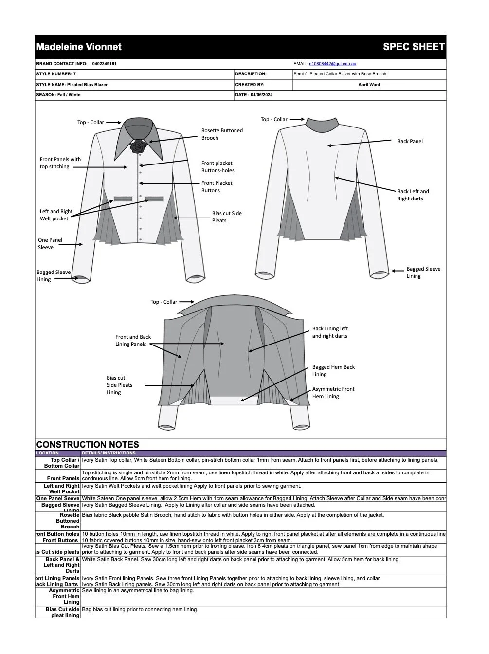
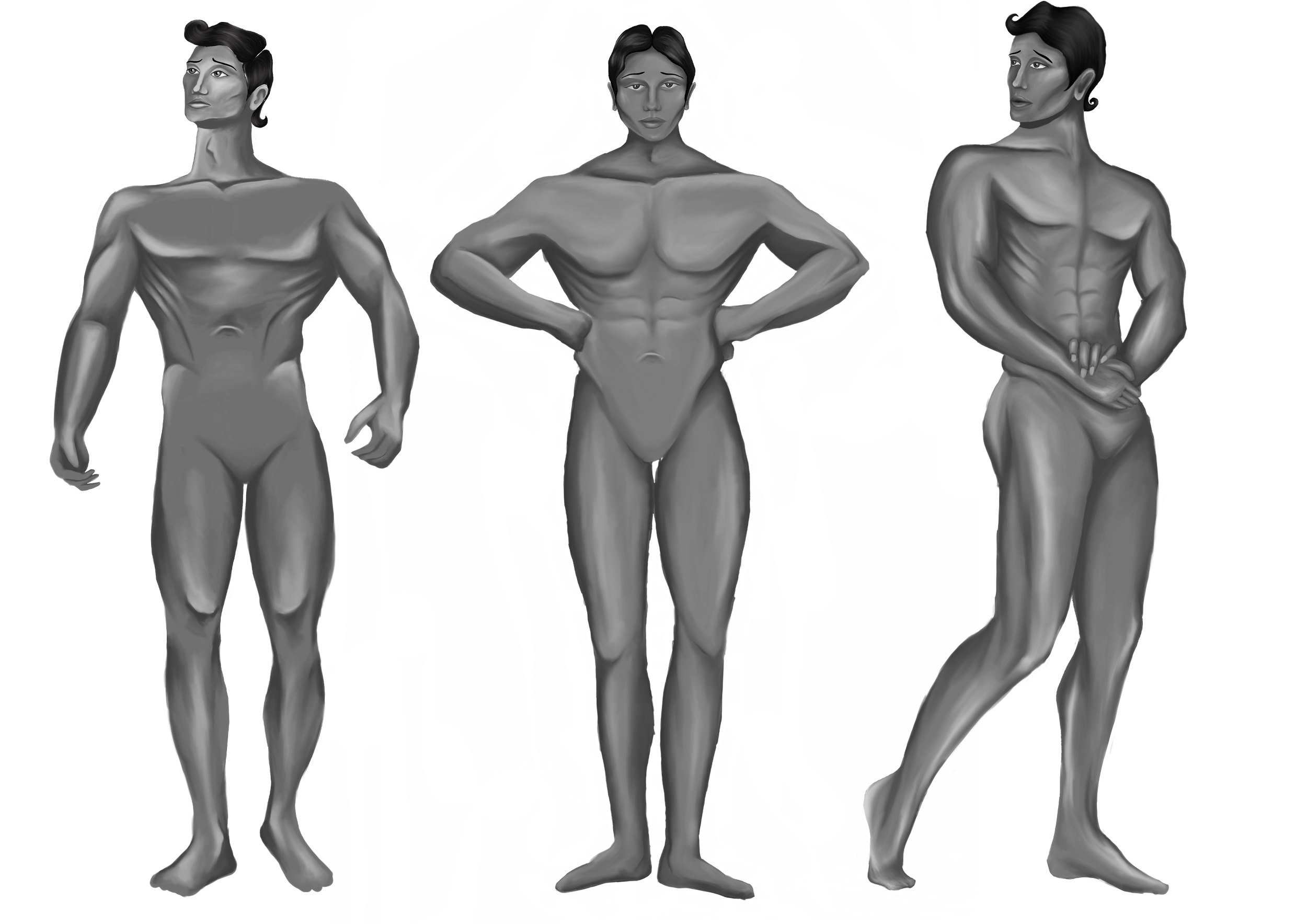
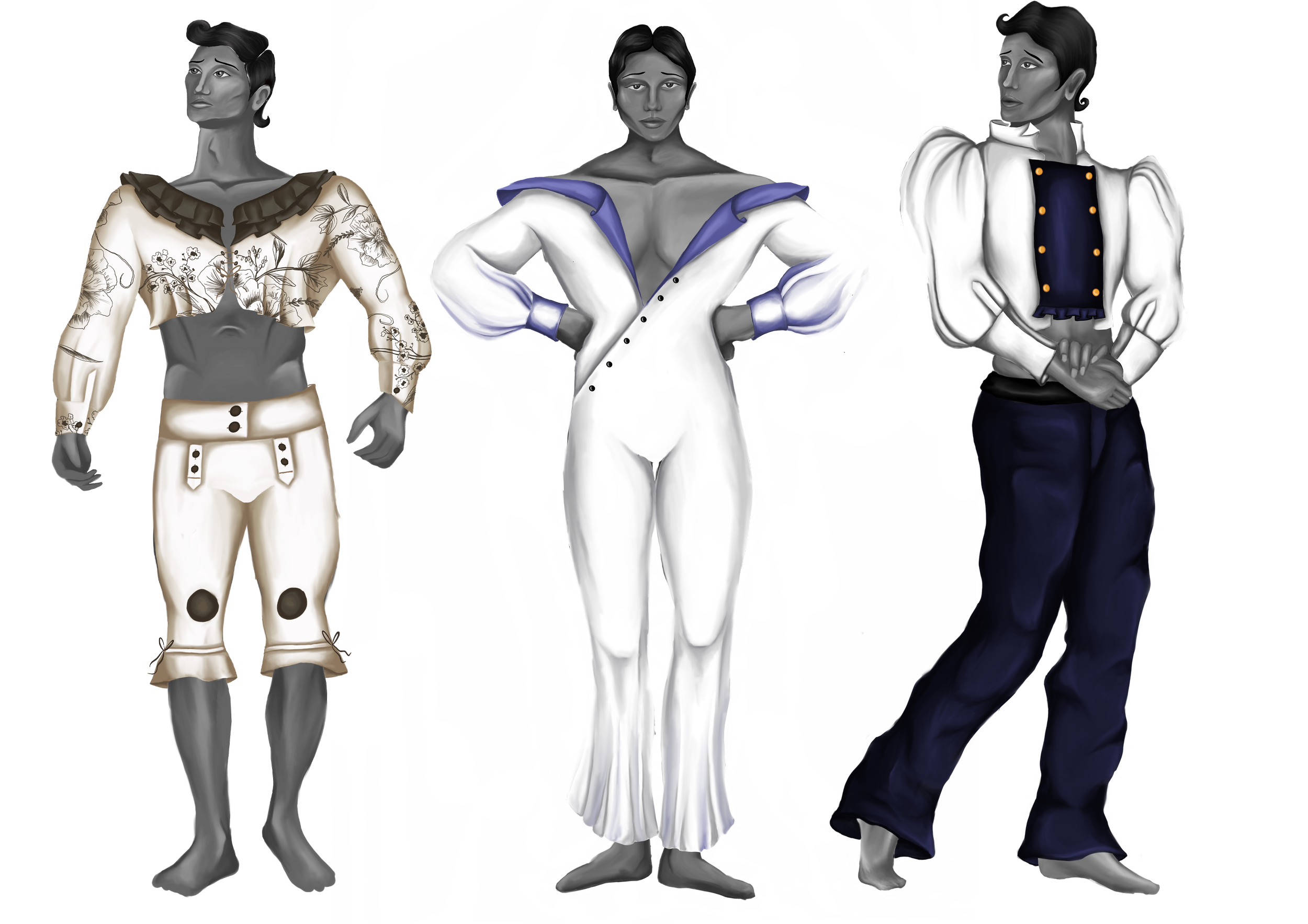
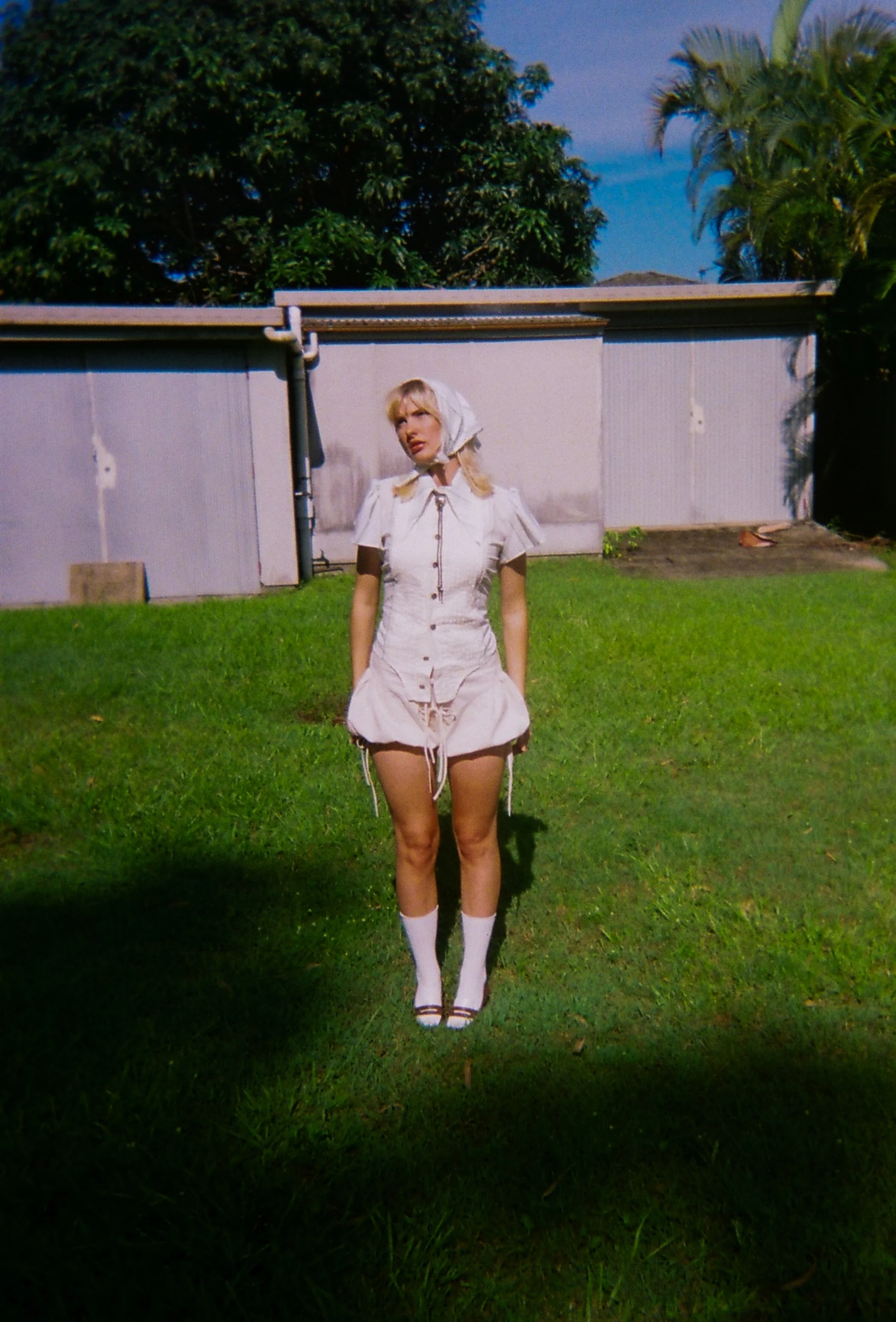
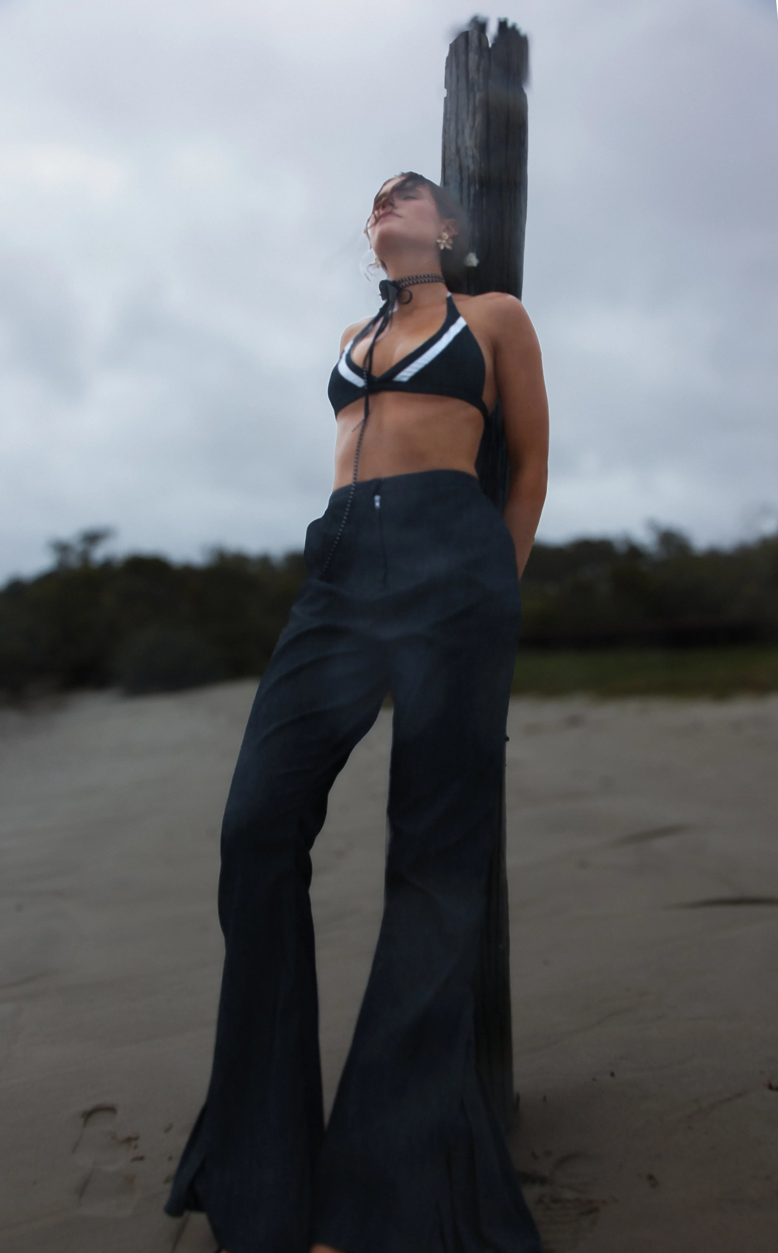
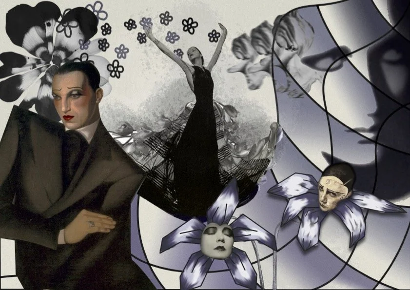
Reviving Madeline Vionnet
A postmodern homage to Vionnet, this silhouette blends Greco-inspired draping with cabaret androgyny to celebrate fluidity and self-defined beauty.
This silhouette responds to the legacy of Vionnet by reimagining her fluid, floral-inspired forms through a contemporary, postmodern lens. Inspired by her Greco-influenced draping and the androgyny of interwar Berlin cabaret, the design challenges traditional ideals of the “perfect” body, embracing ambiguity, hybridity, and self-defined beauty.


Tech Sheet: