‘Girl Dad’ Graphic Design
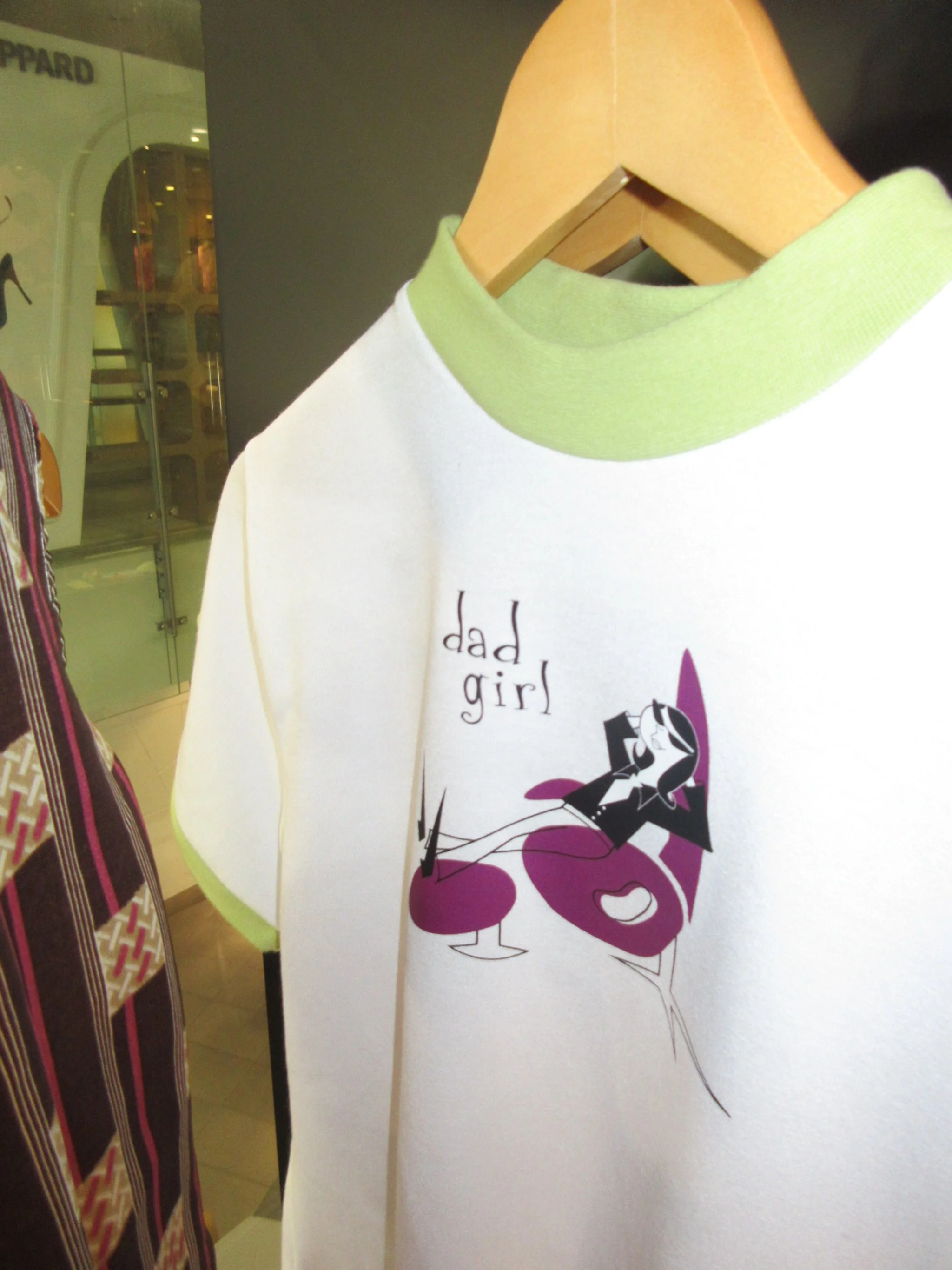
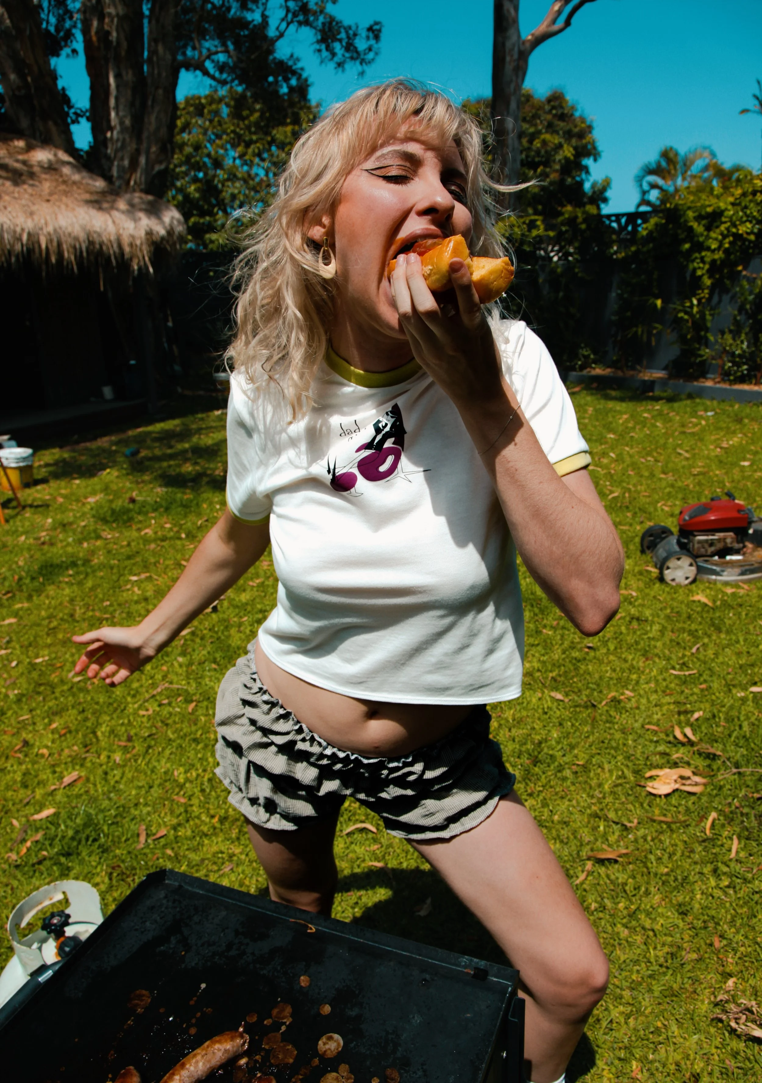
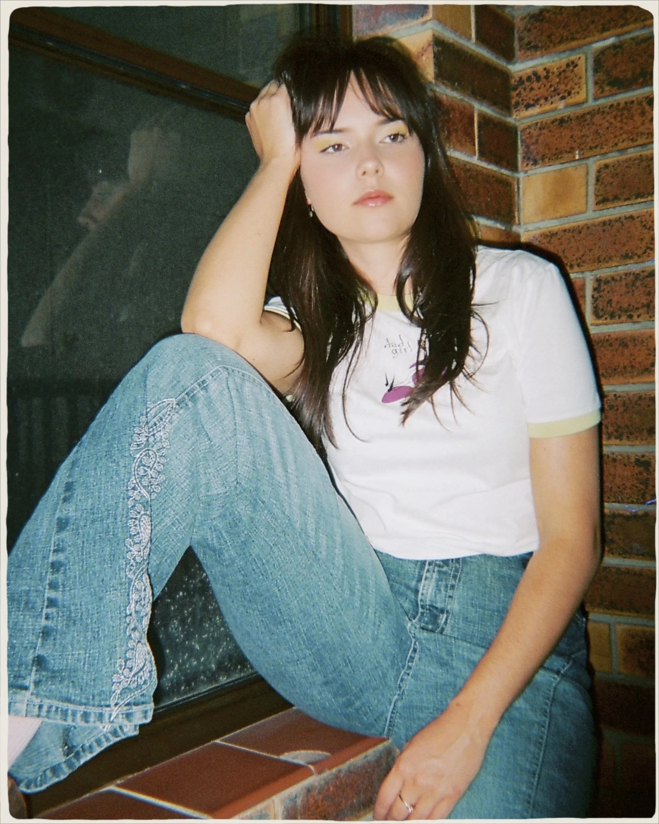

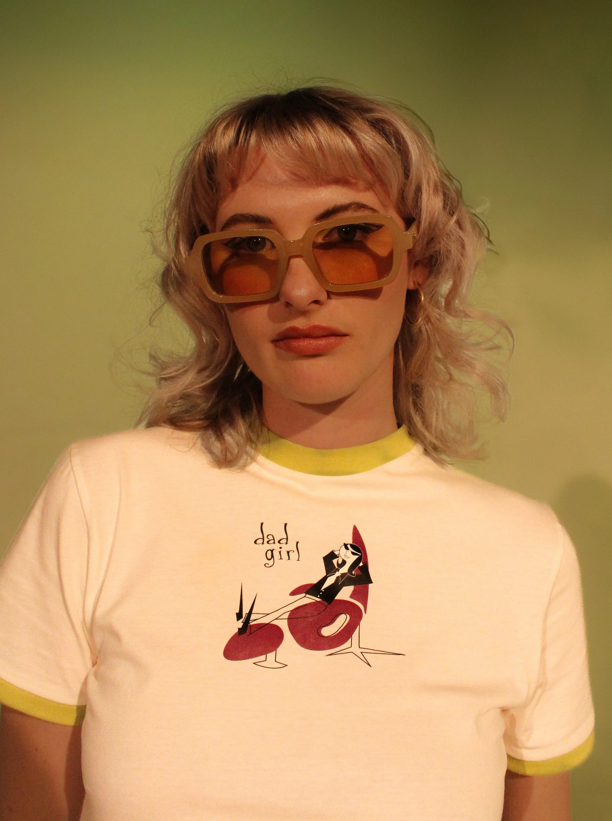
This T-shirt illustration draws from a confluence of retro-futurist and Googie style aesthetics, encapsulating the ironic and subversive spirit of the ‘DadGirl’ concept.


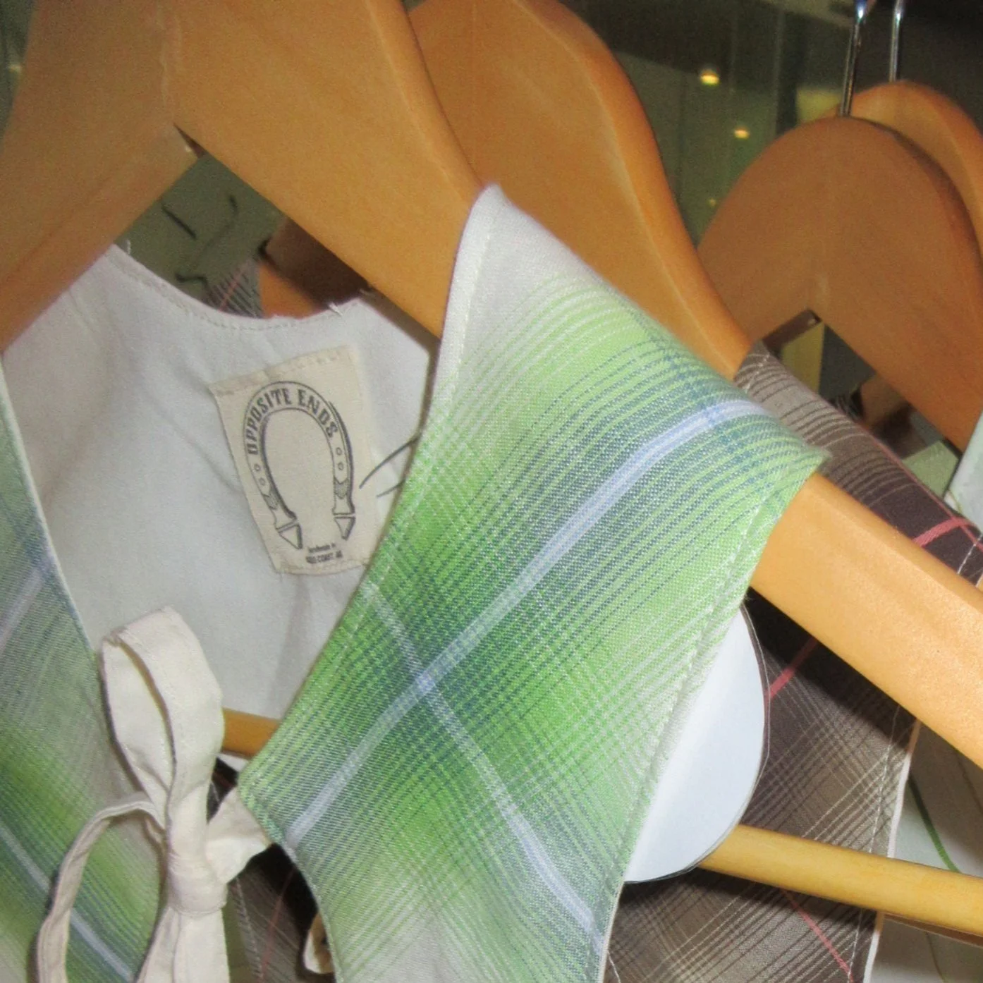
My Brand, Opposite Ends, is a satirical exploration of the contradictions that shape and define our world. It’s horseshoe logo, inspired by the political Horseshoe Theory, which suggests that the political extremes of left and right are not diametrically opposed but rather converge or resemble each other, reflected the brand’s focus on duality and opposing extremes.